
Investment Management: Digital Forecasting Redesign
Throughout my time at Publicis Media, I’ve been contributing to a team building a centralized platform for ad spend information called Investment Management (IM). The tool began as an MVP spend tracking console and has since expanded to include multiple markets, forecasting, and several consoles using data from other ad spend platforms. This provides valuable functionality to our teams.
A few challenges revealed themselves pretty early…
The team was building fast and not doing design QA- if it worked it worked
Users were walled off from the team creating the product—levels of stakeholders played games of telephone to communicate needs
All of the asks went directly into development tickets—there was little consideration for the big picture
This platform was built and iterated upon for well over a year without any product design input.
The lack of design oversight lead to…
Strangely designed fields with awkward function
Misaligned buttons and page elements
Colors that were difficult to read
Bloated and confusing navigation
Hidden affordances and jarring user cues
The application was more or less a pile of requirements and stakeholder requests.
I was determined to give this team product design thinking they would truly benefit from.
Research
Research for this project was very lean. In my role, I made it a priority to establish sound reasoning for our Design decisions, and to validate as often and throughly as possible.
As part of my onboarding for this team, I spent time internalizing our user personas and user journeys (developed earlier by another member of the Design team). I used these to create an idea of our users’ priorities, as well as inform my decisions regarding workflow. This application flow specifically pertains to Buyers, who will be doing the forecasting for each year segment.
Additionally, I spent some of my time conducting competitive analysis on any other financial/spend forecasting experiences I could access for free online. The key competitor I studied was Salesforce, which was one of the only ones I could access due to the subject material.
Initial Audit
I was tasked with designing new sections as they came up. I quickly noticed issues that were only perpetuated by exercising questionable design decisions that had already been made in earlier sections.
A rates entry form I designed using the existing style.
I soon shifted my focus to auditing IM for UX and UI issues that could be repaired without derailing the roadmap. I created this deck to show the team potential improvements to the platform’s UX:
View Audit Deck
Next, the product owners and I discussed which of these they’d like to accomplish. After sizing these fixes, I provided guidance to the developers as we made these incremental changes. It was a small exercise but it was helpful in building trust with a team that was not used to operating with UX input.
Dev Effort Sized Deck
Digital Forecasting 2.0
My next step was to explore improvements to IM from a holistic usability perspective—the objective was now to include larger changes to the workflow of each section, not just small UX/UI wins.
The stakeholders and I agreed that a good place to start experimenting would be the Digital Forecasting module, where our users enter their predicted ad spends for the coming month.
My goal was to make better sense of this task for our day-to-day users.
Whiteboard from initial meeting to review existing workflow.
Day 1
I began by meeting with one of the Product Owners and our VP of Engineering to develop a deeper understanding of the existing Forecasting tool and its intricacies. I documented all of its functions and discussed any feedback that had come from users and stakeholders. One of the main pieces of feedback was that entry level forecasters needed more prompts to complete their task successfully.
Day 2
I then spent some time imagining a newer, friendlier, and more circular workflow in order to improve the forecasters’ efficiency. I also spent this time documenting all of the existing functionality and brainstorming potential enhancements. I set up the whiteboards below next to the main stakeholders’ offices, which helped spur some good conversation about these ideas.
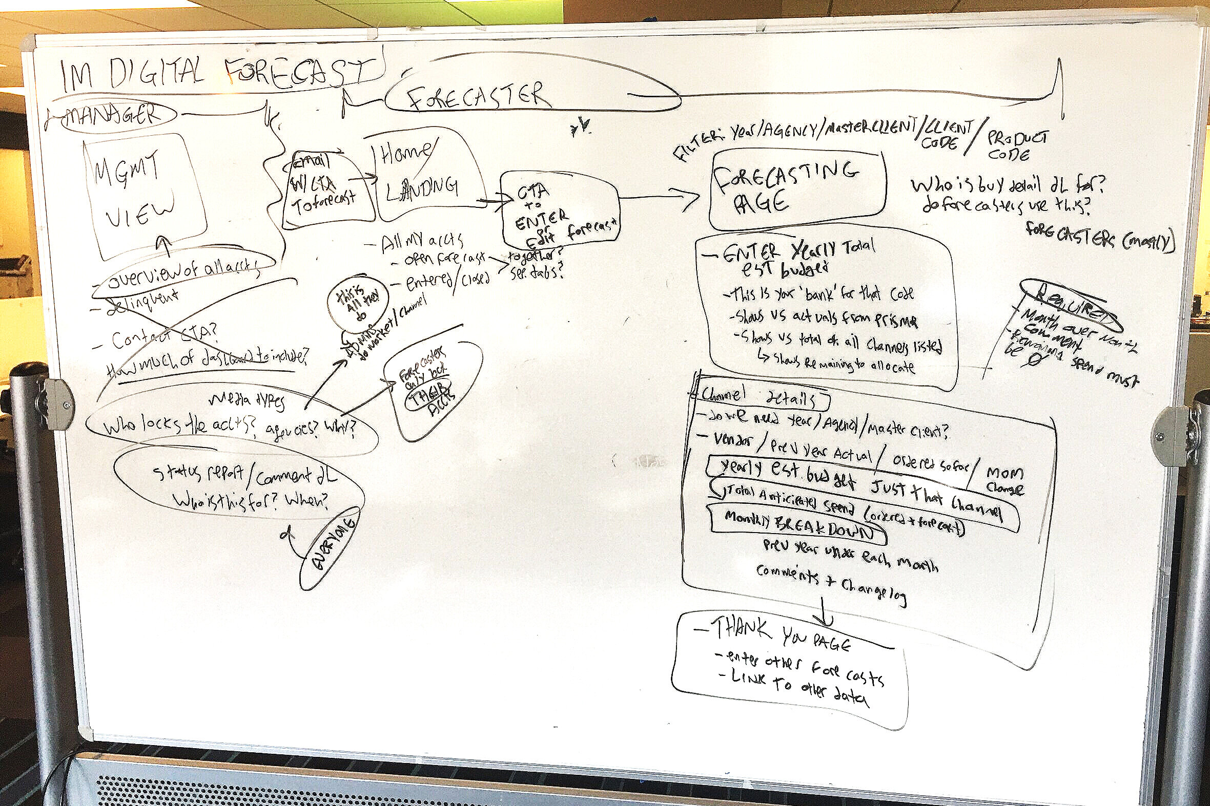
My thinking around what pages may exist in this flow and what they may contain (in combination with what they currently do).
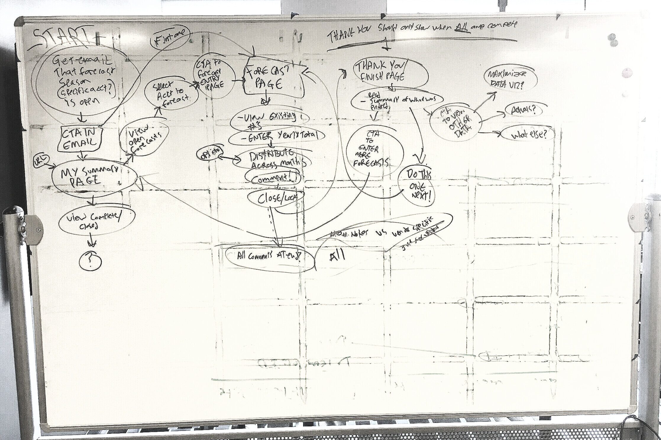
My thinking around the workflow and how users may be routed between pages to keep them within the forecasting task. Explained in detail below.
In these initial designs, users are guided into a path that keeps them forecasting:
They are greeted with an email that the forecasting window is open and are prompted by CTA to go directly into Investment Management.
The user is taken to a landing page where they can select from their clients’ open forecasts. If the user has only one open forecast, they are taken directly into it.
After selecting a forecast, total spend for that client is entered. This is the monthly dollar figure that must reflect aggregated spend amounts across all media channels.
Media channels are then assigned their specific spend amounts in a shopping cart style interface.
A CTA to complete the forecast is unlocked when the remaining total spend is zero, meaning they have appropriately allocated their budget across media channels.
User is then sent to a ‘Thank you’ screen with options to complete other forecasts or view other data.
After discussing this flow as a group and explaining my thinking, I received sign-off from the stakeholders.
Day 3
This day was all about sketching. These sketches show the flow explained above. Additionally, they demonstrate an overview style screen originally intended for management but later added to regular functionality.


Day 4
Using the sketches, I created the first draft of low-res wires and clickable prototypes to validate my thinking.
View Low-Res Wires
We reviewed as a team, and I iterated upon the design to get closer to our target.
Some of the larger changes to the design between low res and final were:
An area for messages to the forecasters from their leadership on Home page was added.
The workflow was connected using tab navigation at the top of the page.
Filtering affordances were improved and made available on the Forecasting page so users can continue their task without leaving the section.
The UI was incrementally tightened with each iteration.
The ‘Thank You’ page was made part of the Home page, appearing when all forecasts are completed.
After 5 iterations, the team settled on a finalized design. Next, I partnered with product management to write JIRA tickets that effectively represented the designs, and worked alongside our developers to ensure it was built to spec.
Afterwards, we checked back with stakeholders, who were happy to confirm that this did indeed simplify and improve their process. Missed forecast deadlines were decreased by nearly 25%, and time-per-forecast decreased by about 15%.
My goal was to provide users with all of their existing core functions while offering some friendly UX thinking to create a more useful tool overall. While there were certainly some challenges in introducing a usability perspective to the Investment Management application, the ultimate outcome was the improvement of the product’s efficiency and the optimization of the team’s processes.