The Team
UX Designer- Matt Klein
UX Lead- Danny Fatto
Project Manager- Markus Unfried
My Roles
Research and Analysis
User Flows
Information Architecture
Wireframes
Prototyping
Project Specs
Timeline: 3 Months~
Tools: InDesign (Wireframes),
Illustrator (Visual Design)
JustinMind (Prototypes)
Proposed Solution
Our solution involved re-envisioning the online application experience from the ground up.
We focused on:
Simplification– Reduce the number of steps from 11 to 3 using progressive disclosure.
Clarity– Introduce interactive elements like in-line error checking and integrated help to lower confusion and abandonment.
Language– Warm, friendly copy that elevates and humanizes the brand.
Over 3 months, we transformed a multi-step application into a fast and easy 3-stage process, establishing a new standard for online account opening.
The Challenge
Increase online account conversions.
My team was tasked by TD Bank USA to address their challenges in converting site visitors into customers, and as a result, improve their online sales. Working with senior designer, Danny Fatto, we mined their analytics data, identifying key barriers to conversion in the funnel. Conducting qualitative interviews helped us learn the root causes of abandonment: users found the enrollment process complicated, confusing, and generally daunting.
Our Approach
The first step of this engagement was to inventory all the existing content and functionality. I documented every field and function throughout all of the types of account opening flows that TD Bank had in place. In doing this, it ensures the new design will collect all of the same information and contain all of the same functionality. This also gave us the opportunity to familiarize ourselves with the interactions and patterns that were in use.
Part of this first step was to print out all of the screens from the existing flow, making notes on what we felt worked and what didn't work. At this stage we were still learning about the process so we also used this as an opportunity to document questions we had for TD's BA team.
From my research of the site's structure, I was able to create a set of documents that show where each account type exists within their business and site architecture.
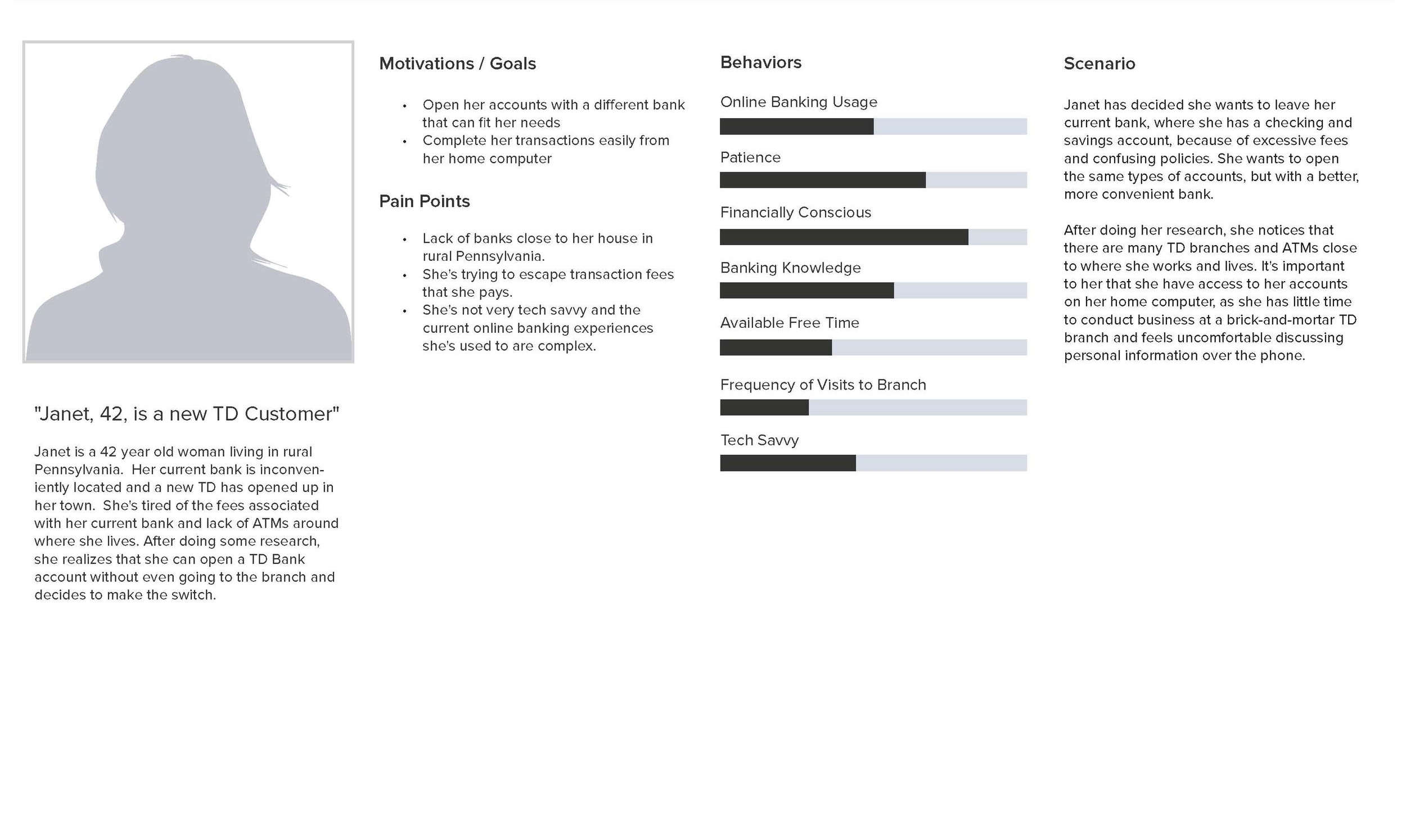
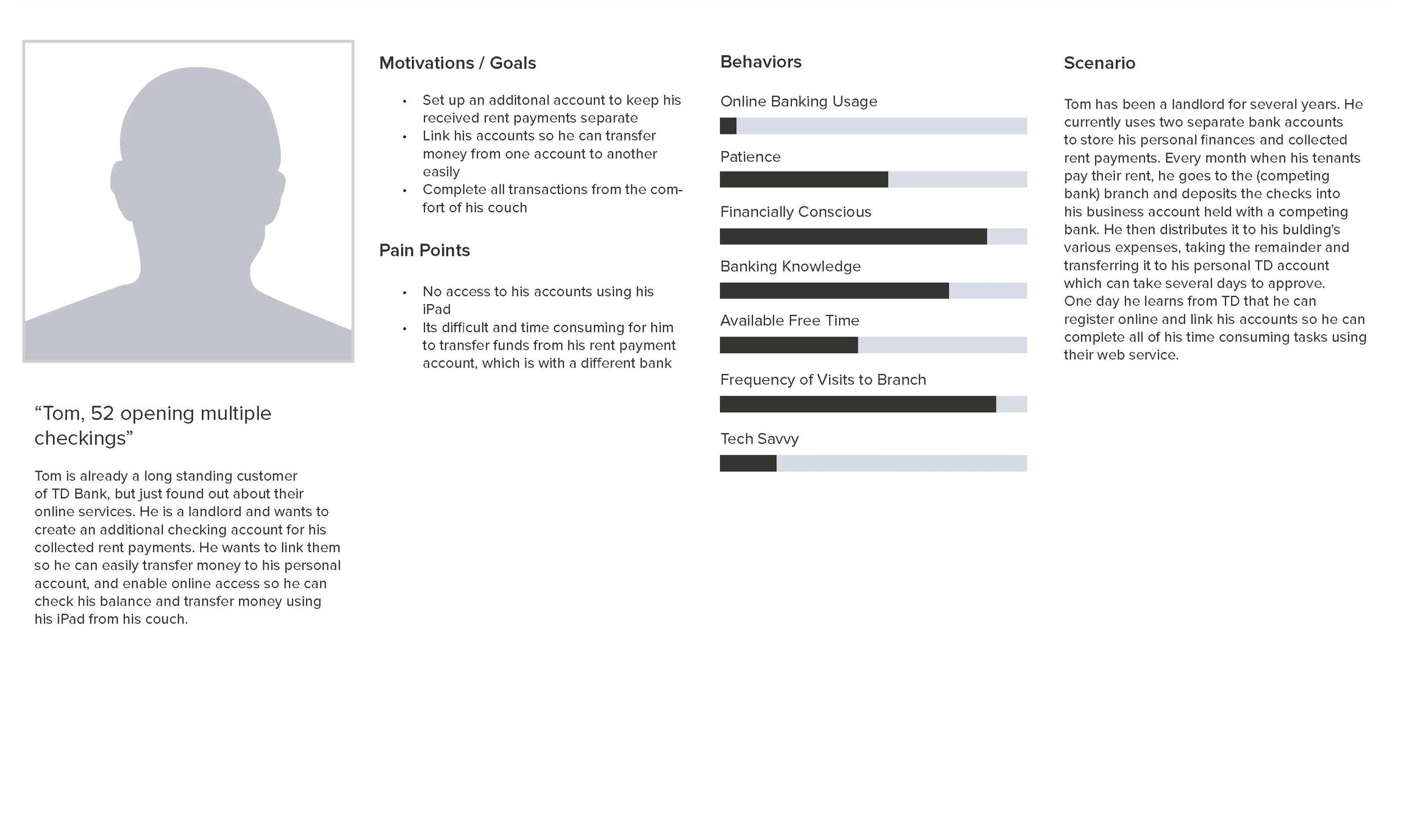
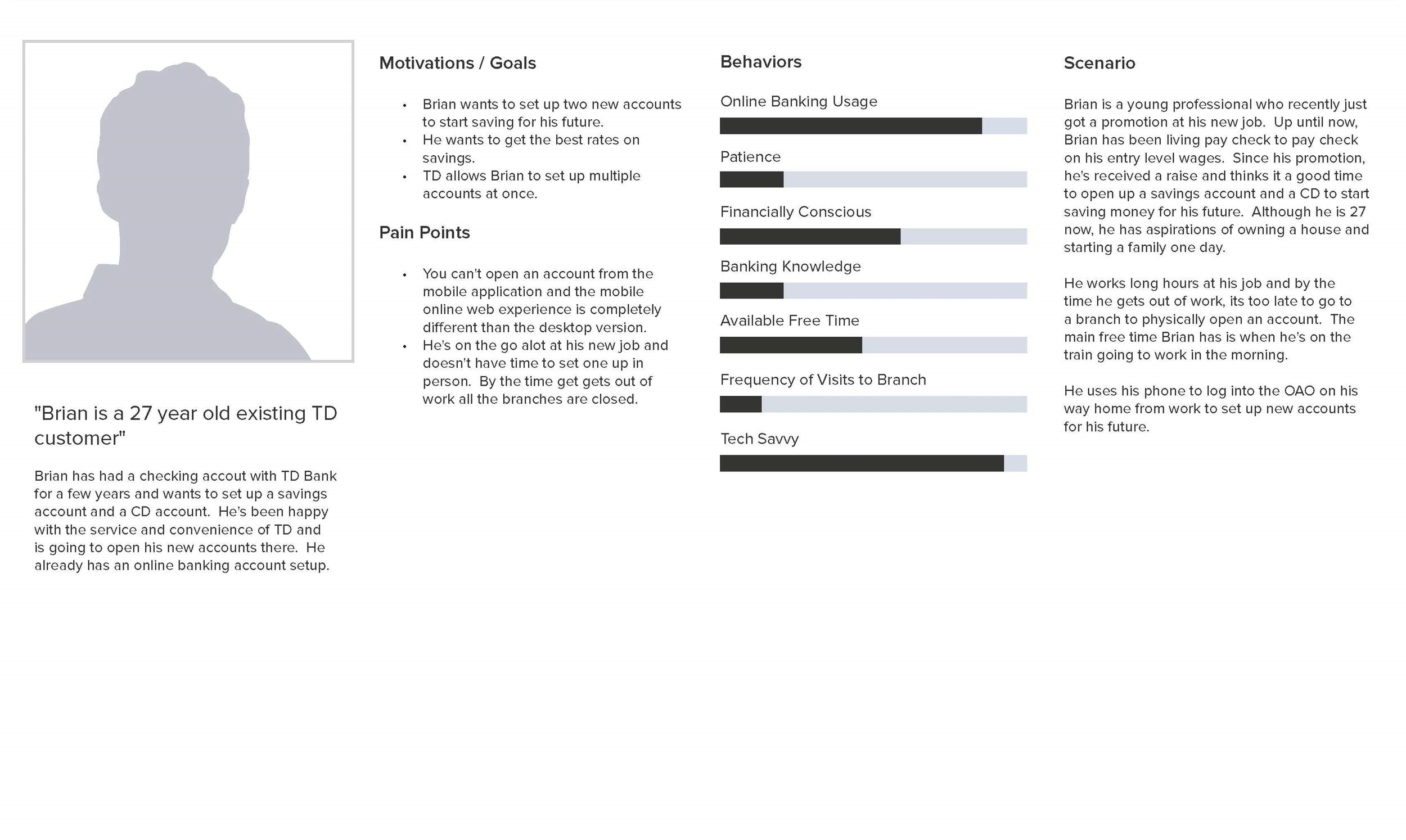
Based on this analysis of the experiences, Danny and I created rough personas to represent the different types of users and use cases.
The three main use cases accounted for in our design, as determined with the help of the TD BA team, are:
New to Bank (N2B): This customer has no existing relationship with TD Bank.
New to Channel (N2C): This customer has a TD account but has not used any online banking features yet.
Registered in Bank (RiB): This customer has a TD Bank account, and an online account. They are looking to open an additional online account.
Based on this, I also created a functionality matrix, to help guide our wireframing process (see below)
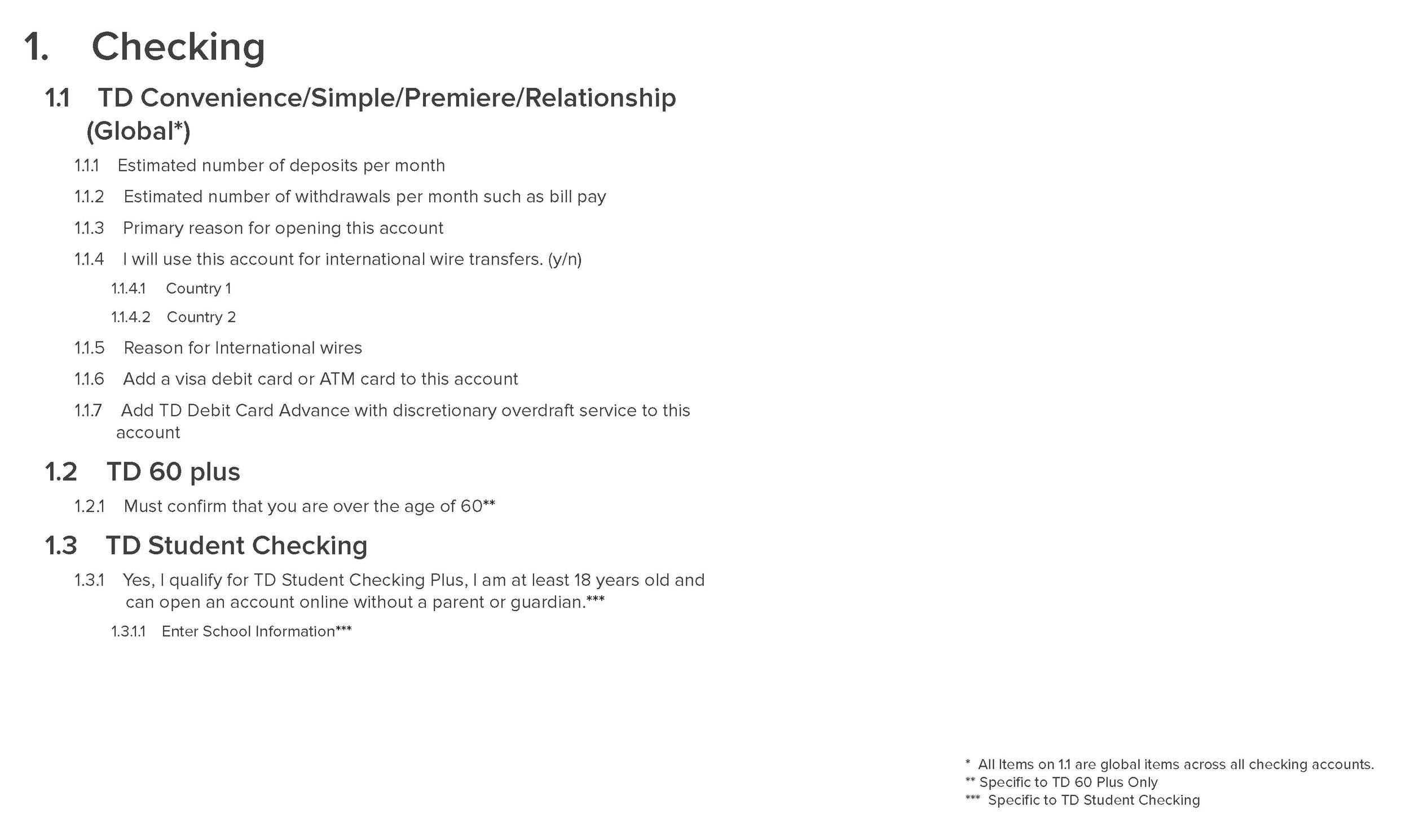
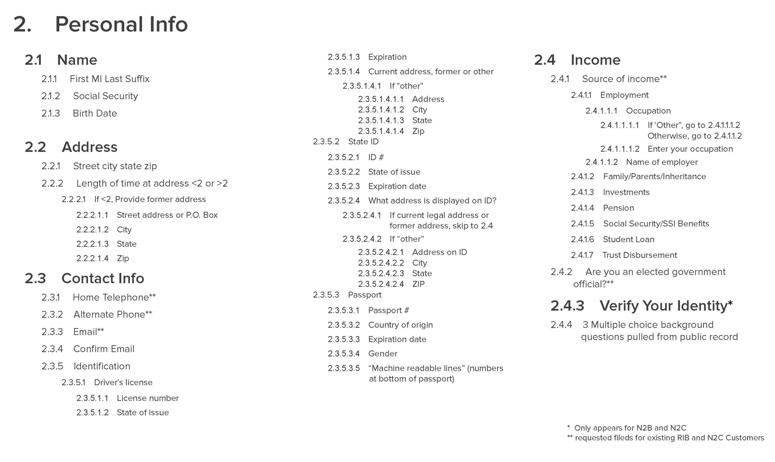
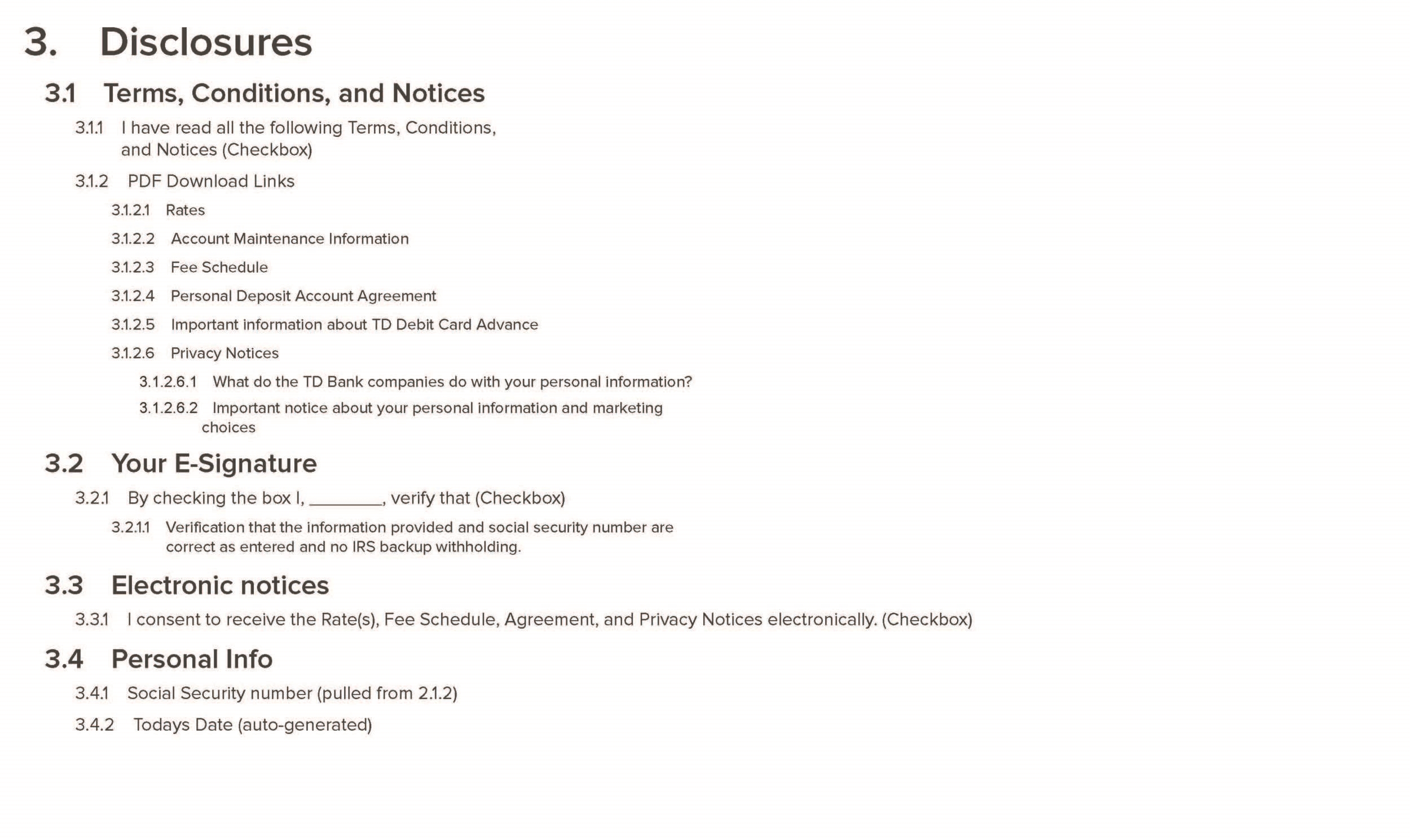
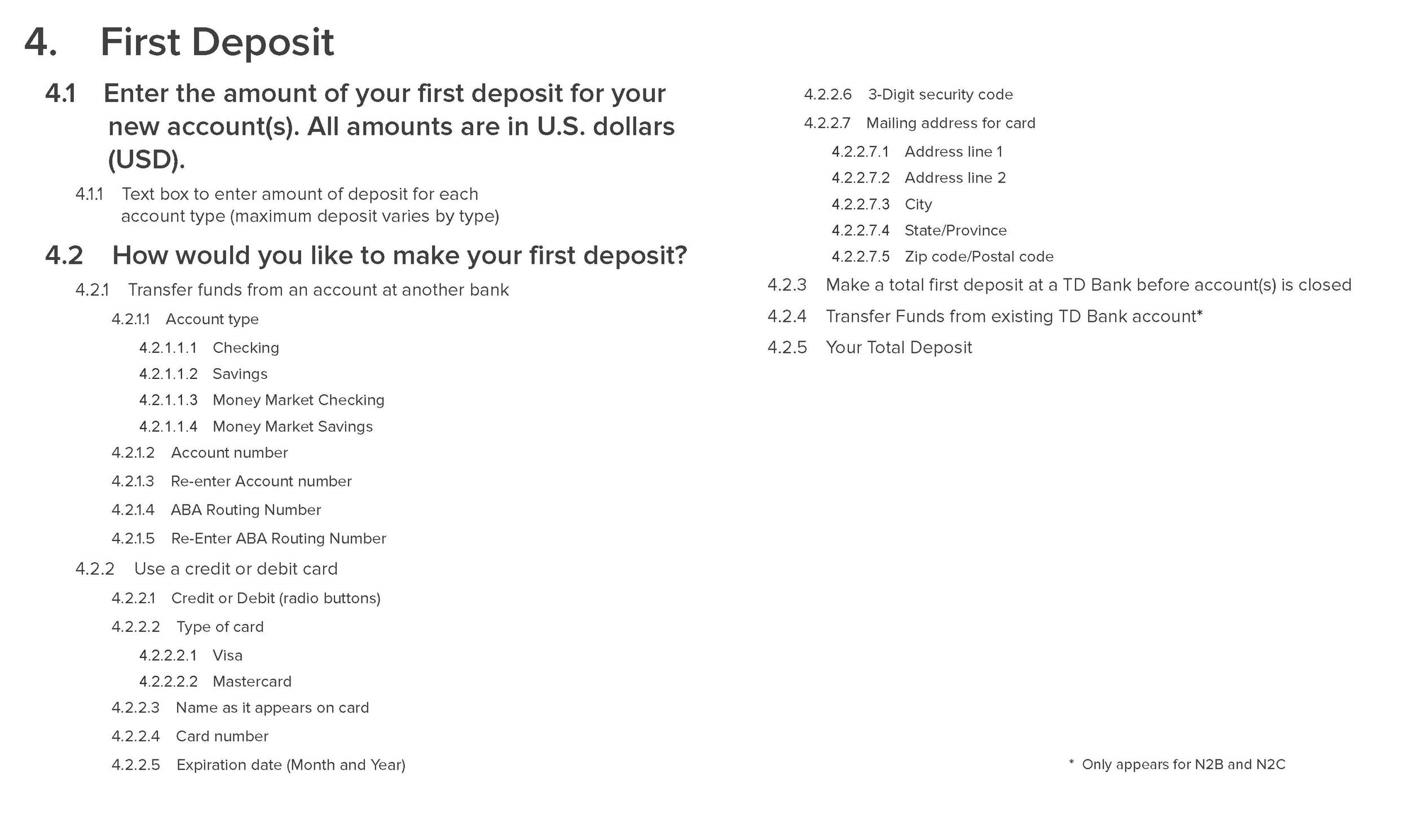
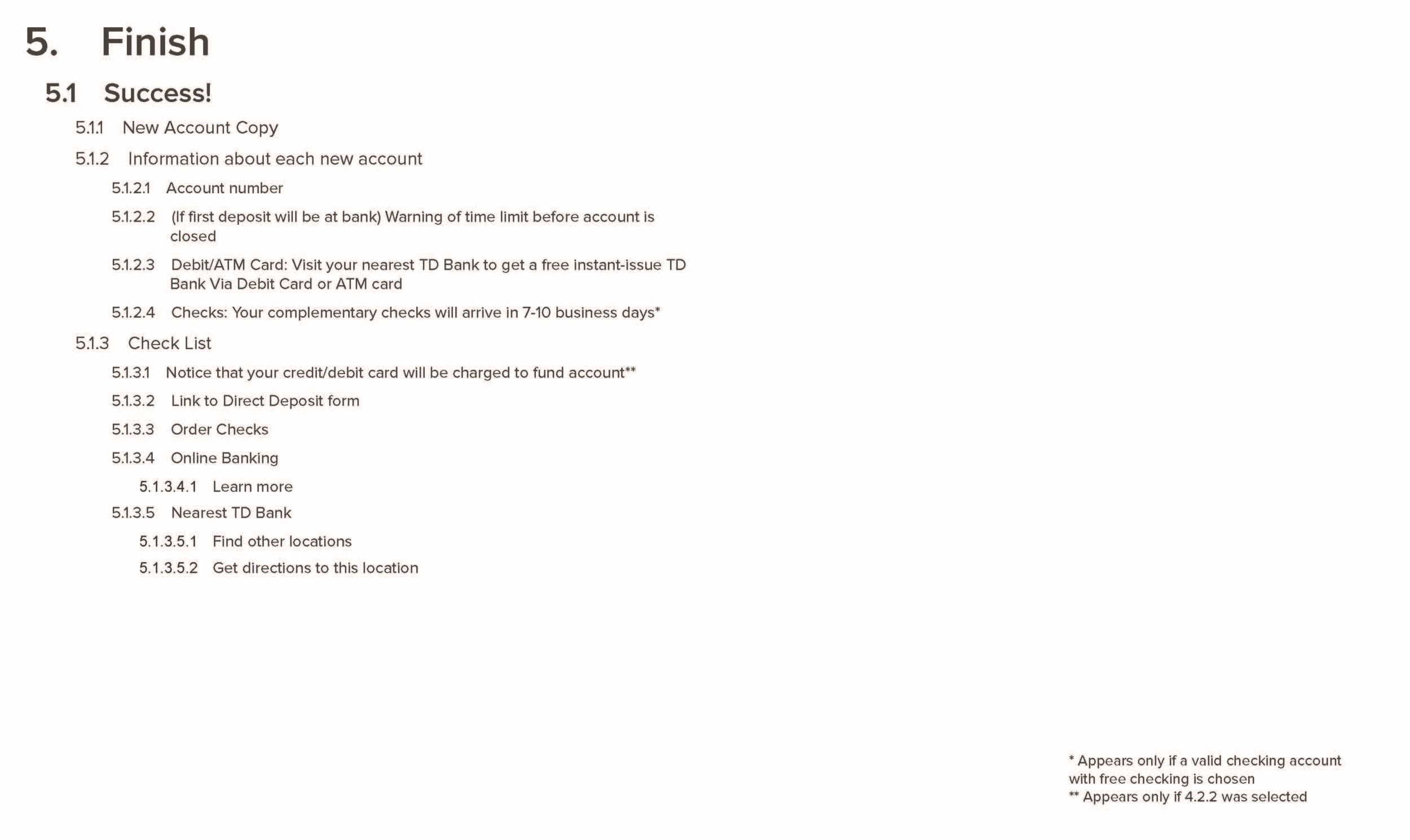
Here's an excerpt from the documentation that catalogs the previously existing form flow.
Using all of the research, in addition to putting ourselves through the flow exhaustively using a test account,
we were able to come to a few conclusions about the design they had in place and the approach we'd take in our new design:
The application was not dynamic- It would ask a series of pre-loaded questions, many of which would not pertain to the particular type of account being opened. A lot of information was presented at once, causing cognitive overload. Our solution involves using dynamically customized forms based upon the account type selected. We decoupled the account selection process from the secure form, which allowed us to send the specific type of form needed to open that type of account and reduce useless form fields. We also present information using 'progressive disclosure', only revealing questions that need to be answered, in accordance with a given scenario.
The application was impersonal- The first type of questions were anti-money laundering and regulatory questions. We explained to the client that this approach was very forward and scary for someone new to signing up for a bank account online. We advised to take a more natural and conversational approach, starting with 'The Basics' (name, phone number, address).
Capture contact info early- By starting with a more conversational approach, this allowed us to capture the contact information upfront without being invasive. In their previous flow, they don’t ask for any contact information until the second page of the application, after many have already abandoned the process. By collecting this vital information earlier in the process, it allows TD to follow up with any customers who may abandon the flow.
Simplify the legalese- The disclosure page and other legalities were a long endless scroll on the third page, displaying pages of legal jargon that only a lawyer could understand. We advised to put the documents in an I-Frame and have a summary of the main points at the bottom that customers can agree to in a single check box. This was one of the most difficult parts because we had to complete around five iterations to gain approval from the compliance department.
Reduce distractions- Their business strategy involved attempting to cross-sell other products throughout the application process, causing annoying road bumps for the applicant. Their research shows that less than 1% of users actually go down the path of opening additional accounts. We explained that they were catering to an edge case because of the sales department’s pressure for extra conversions, but were in fact deterring the majority from completing the form quickly. Our suggestion was to offer add-ons to the final page of the form, the 'Go' page. This allowed the correct type of accounts to be cross-sold based upon the account opened, and streamline the process the second time around by having all of the personal information pre-filled.
Improve account linking- Existing customers needed an easy way to successfully leverage their relationship with the bank to streamline the process. Using personal data like Name, D.O.B. and Social Security Numbers, or existing online banking credentials, we were able to link users to existing bank accounts. In doing this, we were also able to minimize third-party verification.
Our Solution
Whiteboarding
After compiling our research, we locked ourselves in a room and did some whiteboard sessions to brainstorm new user flows that remedied the issues we identified in the process.
We proposed a three step process, 'Ready, Fund, Go', that streamlines registration with the intent to reduce the user drop-off rate when opening a new account.
Patterning
Initial wireframes were lo-fi, to help us understand how the information would be presented. A lot of ideas were explored in this step and at the end, we decided grouping the questions into segments and presenting them as info-cards would be the most effective solution.
We presented a series of wire flows to the stakeholders to validate our concept before proceeding to more thorough and detailed wireframes.
User Flows
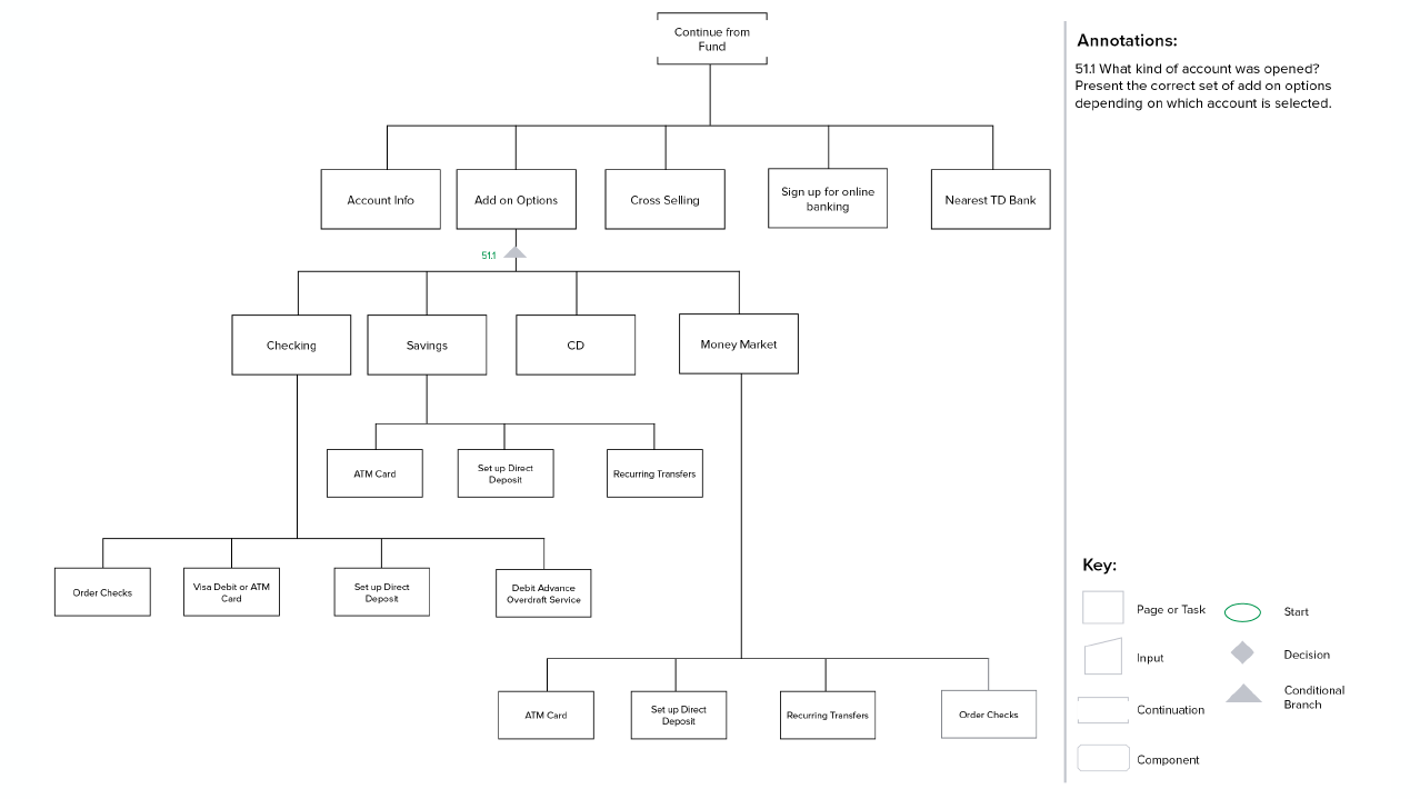
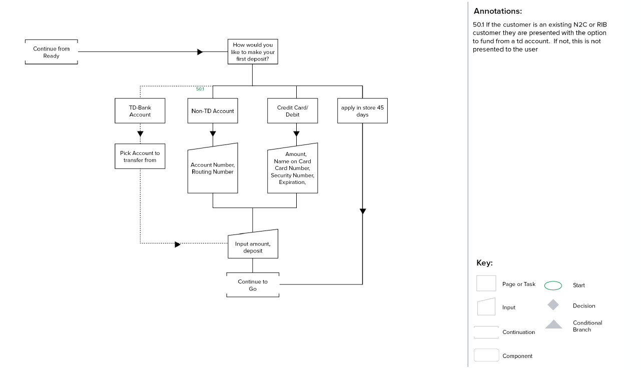
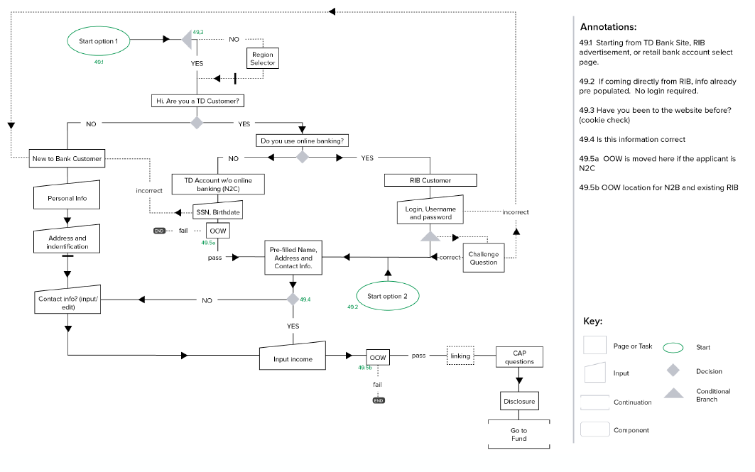
Before diving into the complex information architecture flows that the TD Bank BA team required for documentation, we created simple user journeys. This exercise proved useful both in understanding the process at a high-level, as well as for presentation to stakeholders that may not be familiar with a more complex flow diagram.
Below is an example of one of the more complex user flows that we created for TD’s BA team to validate our approach with compliance and the backend systems, which had to remain unchanged by our re-design
Wireframes
We designed for two breakpoints when creating the wireframes. The system was built on bootstrap, so we decided to design for the <992px breakpoint for laptop/tablet and <480px for mobile viewports. Every possible situation was documented and accounted for, resulting in a delivery PDF totaling 160 pages.
Here are a few excerpts from the annotated wireframe document:
Visual Design
Once the wireframing process was near completion, the visual design team at Capco created a hi-fi mockup of our design in accordance with TD's "Emerald Standard" style guide.
Prototype
I used the program JustinMind to create a highly functional prototype for desktop and mobile that was used for concept validation, qualitative testing, and client presentation for approval.
TD employed a third-party testing lab that ran both mobile and desktop testing across 20 participants. The results yielded were helpful in informing further iterations upon the design.
Test Findings
Through user testing, we were able to determine a few key errors in our design:
Problem: At first we had a 'hero' banner image that contained important information about the account, but most people were dismissing it as marketing. Research showed that many people skip past these types of images because they associate them with advertisements.
Solution: By simplifying the area with a flat, photo-free visual style, we were able to refocus their attention to the important information.Problem: In the first iteration of the prototype, the user was able to scroll to future fields further down the page despite the fact that they were not active until the preceding section had been completed. Users found it daunting to see the “road ahead”.
Solution: We disabled the ability to scroll beyond the current active card, keeping the customer in the moment and focused on their task.Problem: Originally employing a simple and visual “filled vs. hollow” dot method to number sections, testing showed that older applicants did not make the connection.
Solution: In reaction, we added copy indicating which step number in the process the customer is completing.
Final Thoughts
Despite technical and regulatory restrictions, this project accomplished all goals set at kickoff. We took an outdated system and transformed it into a modern, responsive, and scalable architecture that TD can build on for future projects. We transformed a very impersonal, robot-like, and daunting application into a conversational and smooth three-step process that can be completed in under 5 minutes.
Customers no longer need to travel to the bank branch to create an account, they can open one from any digital channel they choose.


