Heart Partner App Updates
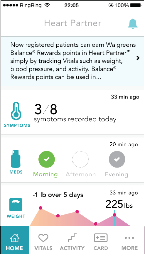
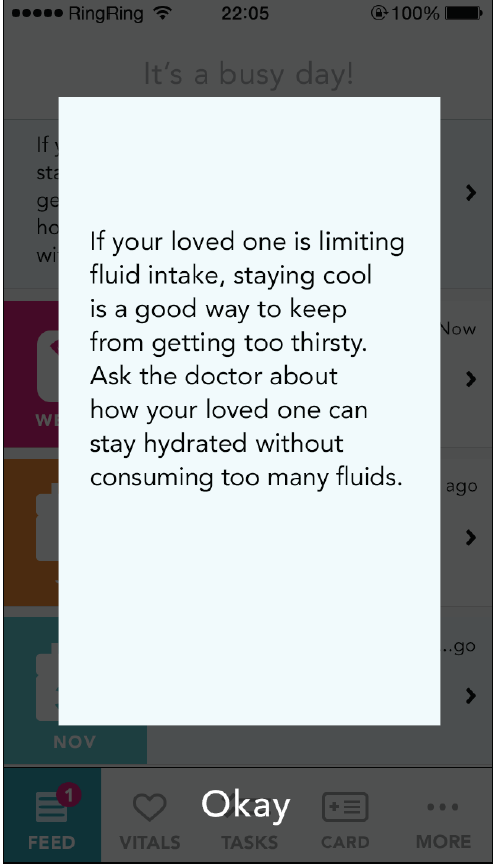
Heart Partner is an app created by the FCB Health UX team for Novartis Pharmaceuticals, to indirectly support a heart failure medication they produce. The app enables patients experiencing heart failure (generally older people), to track their health with the assistance of a care team consisting of their family members and/or professional caregivers. This shares information about the patient's well-being with their family, additionally assisting them in coordinating necessary care for the patient. The app tracks health symptoms, medication adherence, weight, exercise, doctor appointments, and other metrics relevant to heart failure patients.
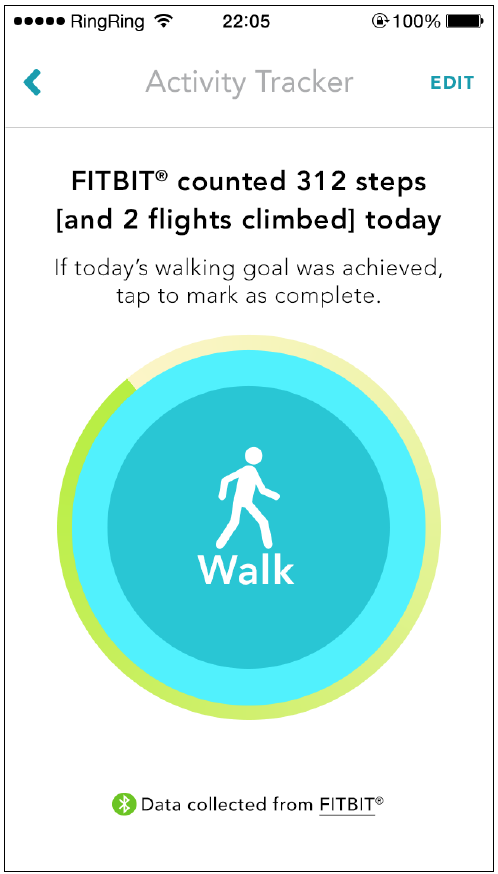
When I joined the FCB Health team, the project had been through two feature updates and we were preparing for the third, which would include adding support for Fitbit, Jawbone, and Withings devices.
My role:
Identify places in the app where activity tracker and smart scale data could be used
Update Wire Frames to account for this new data
Guide Art Director in updating layouts
Update functional annotations
Work with account team to determine business rules for manually vs device-tracked data
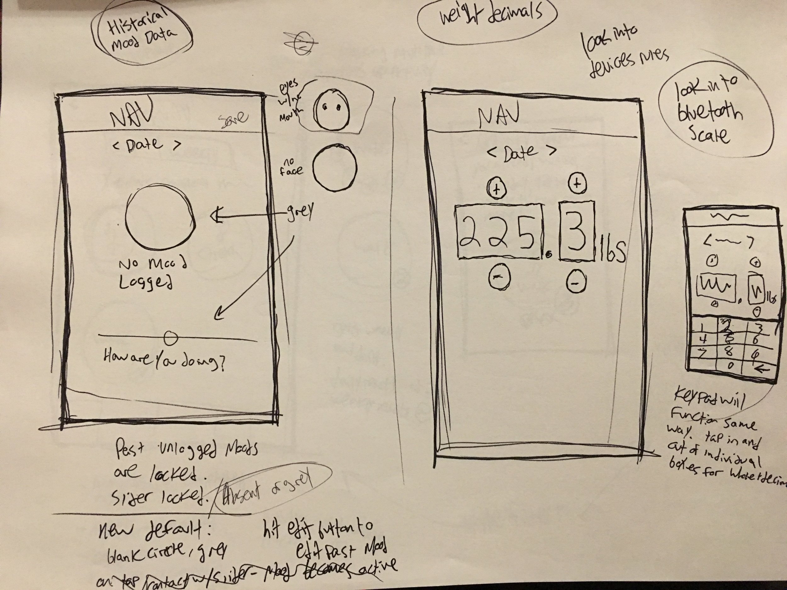
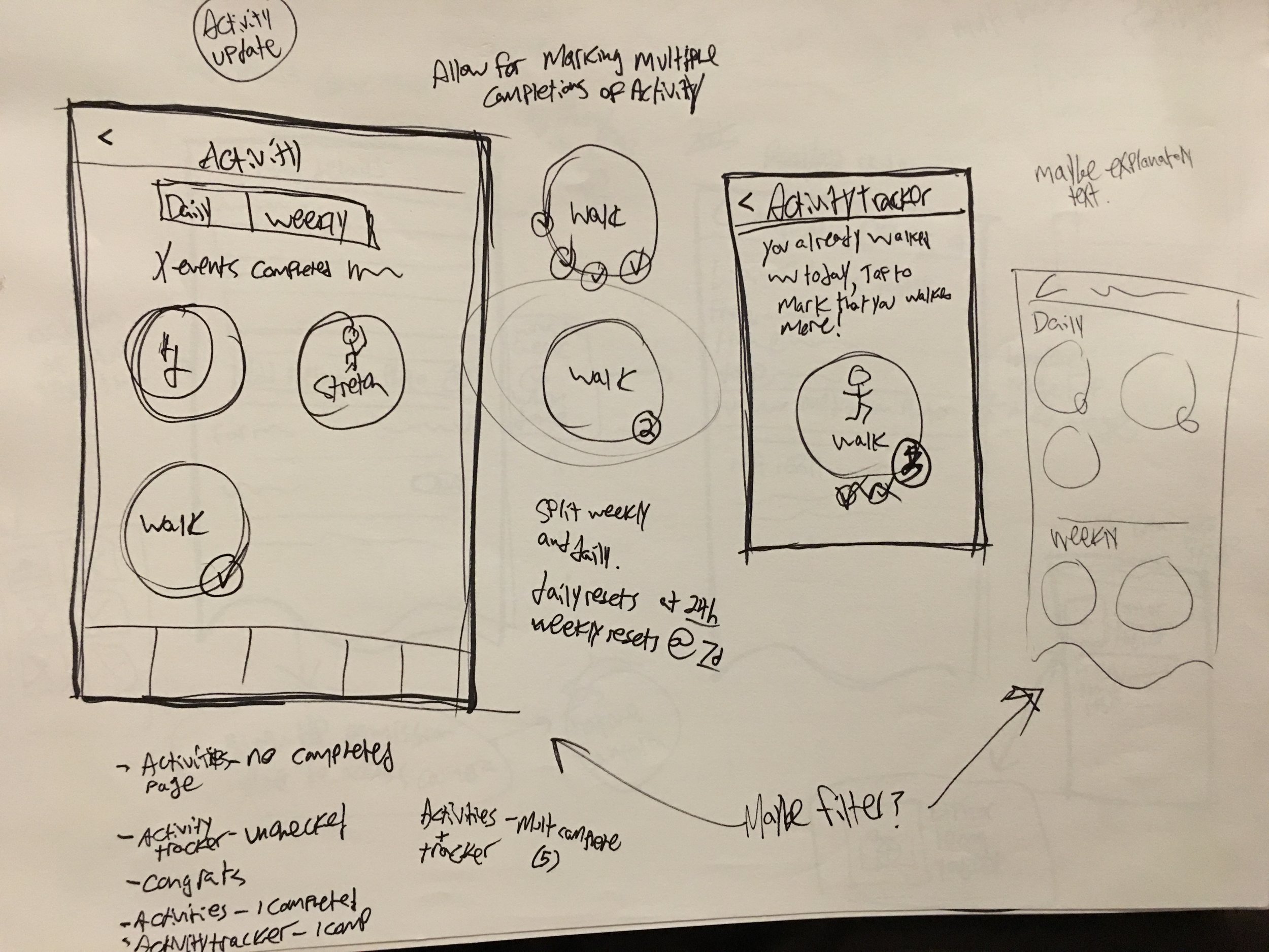
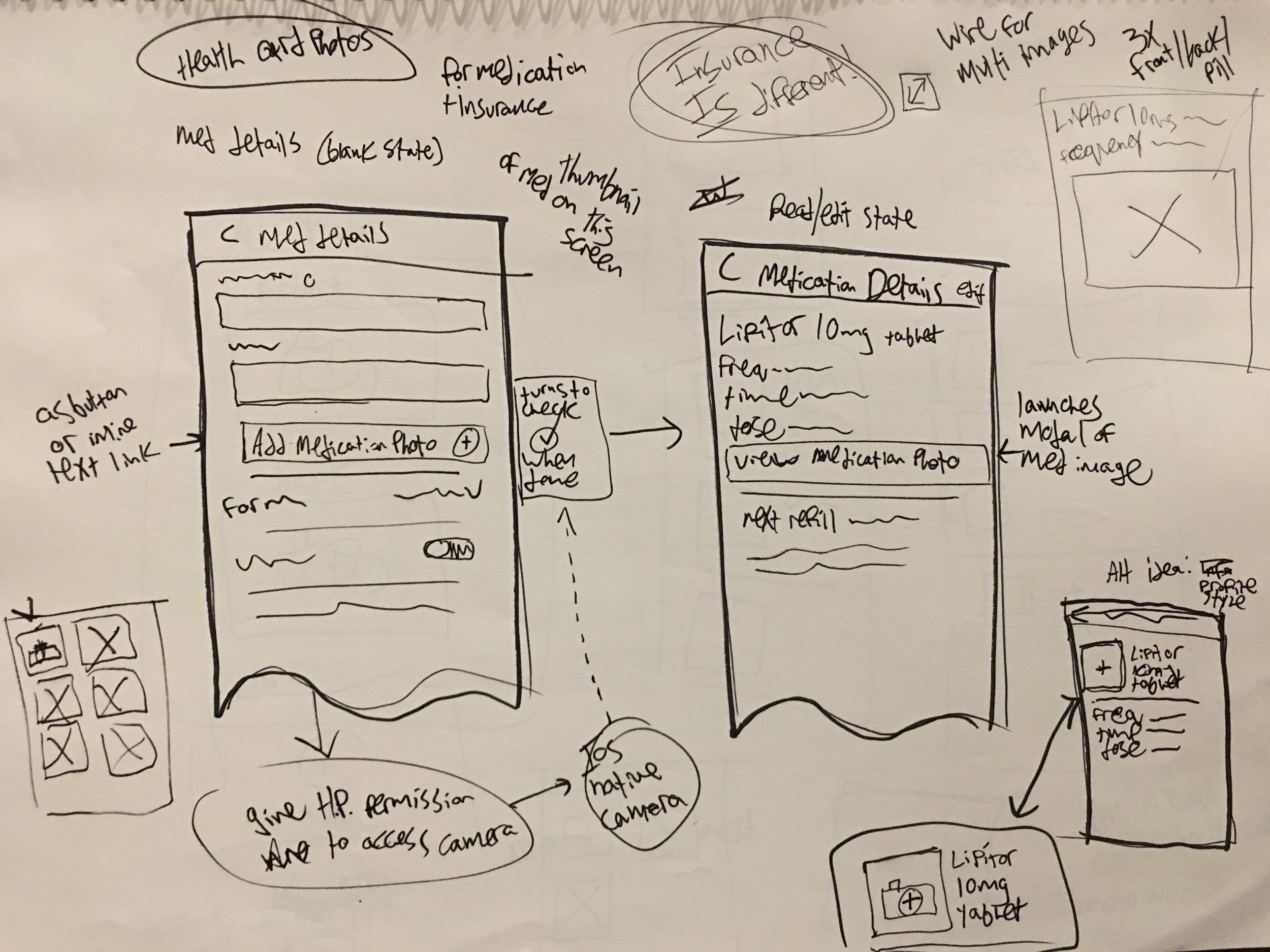
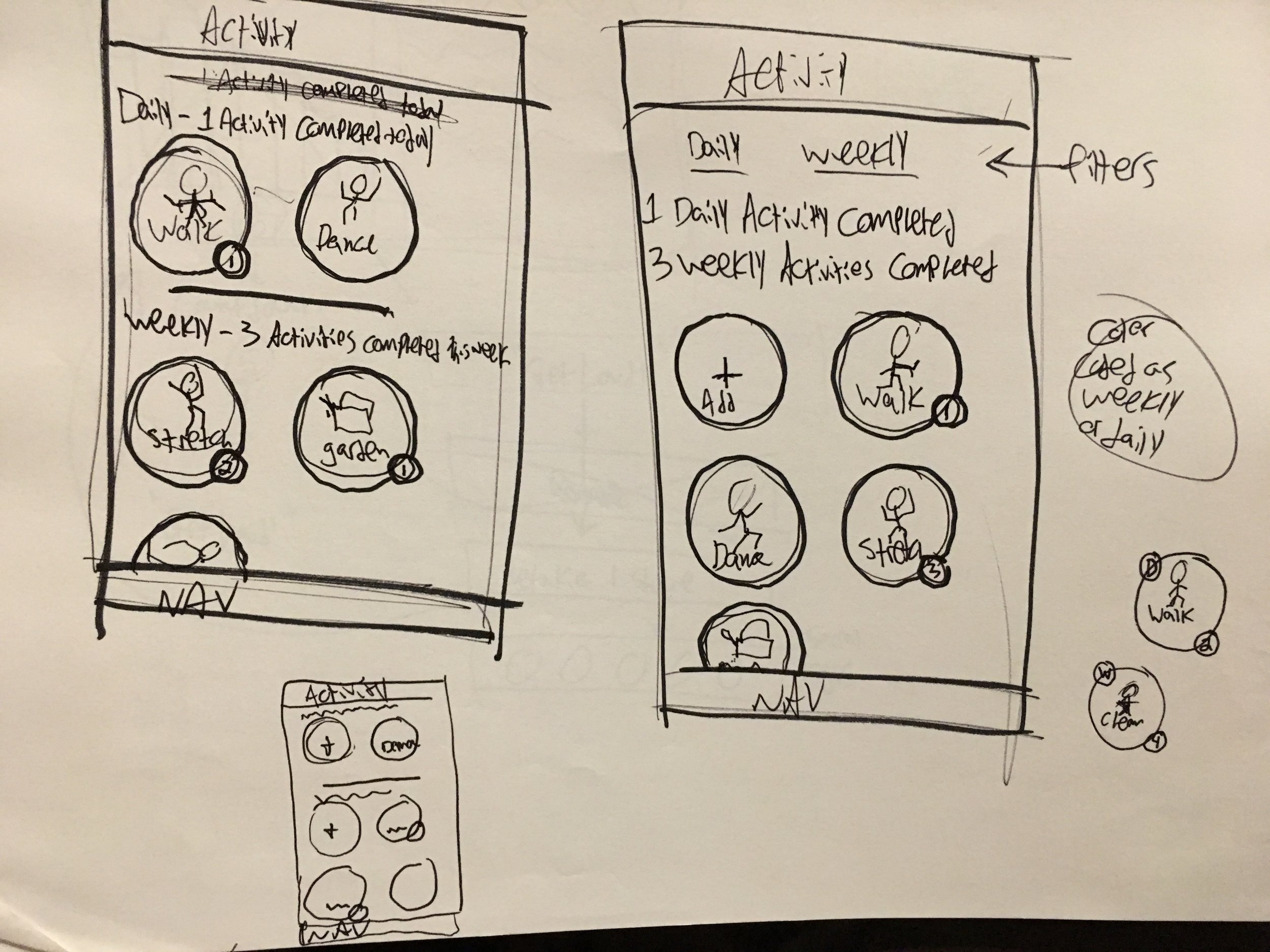
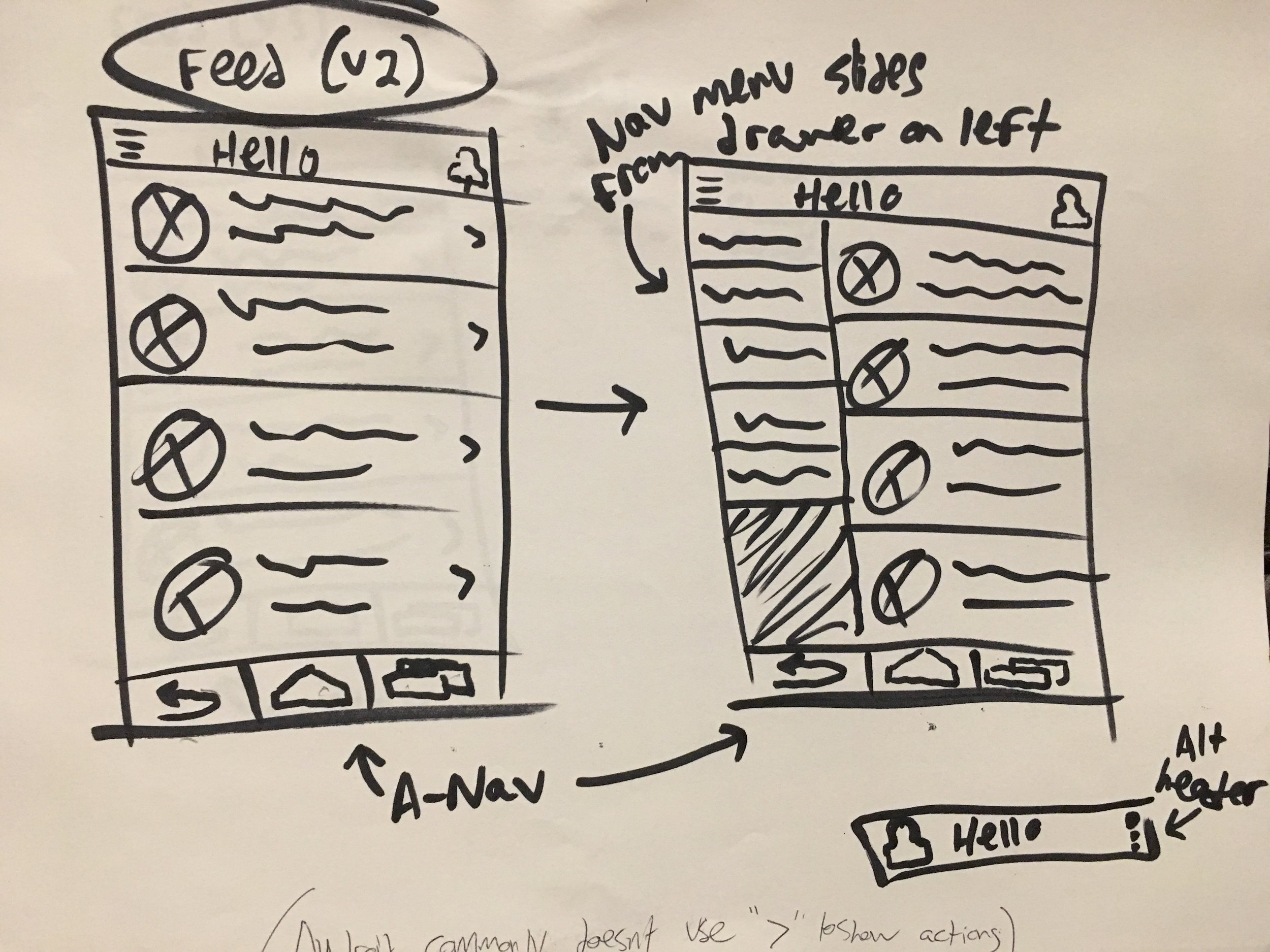
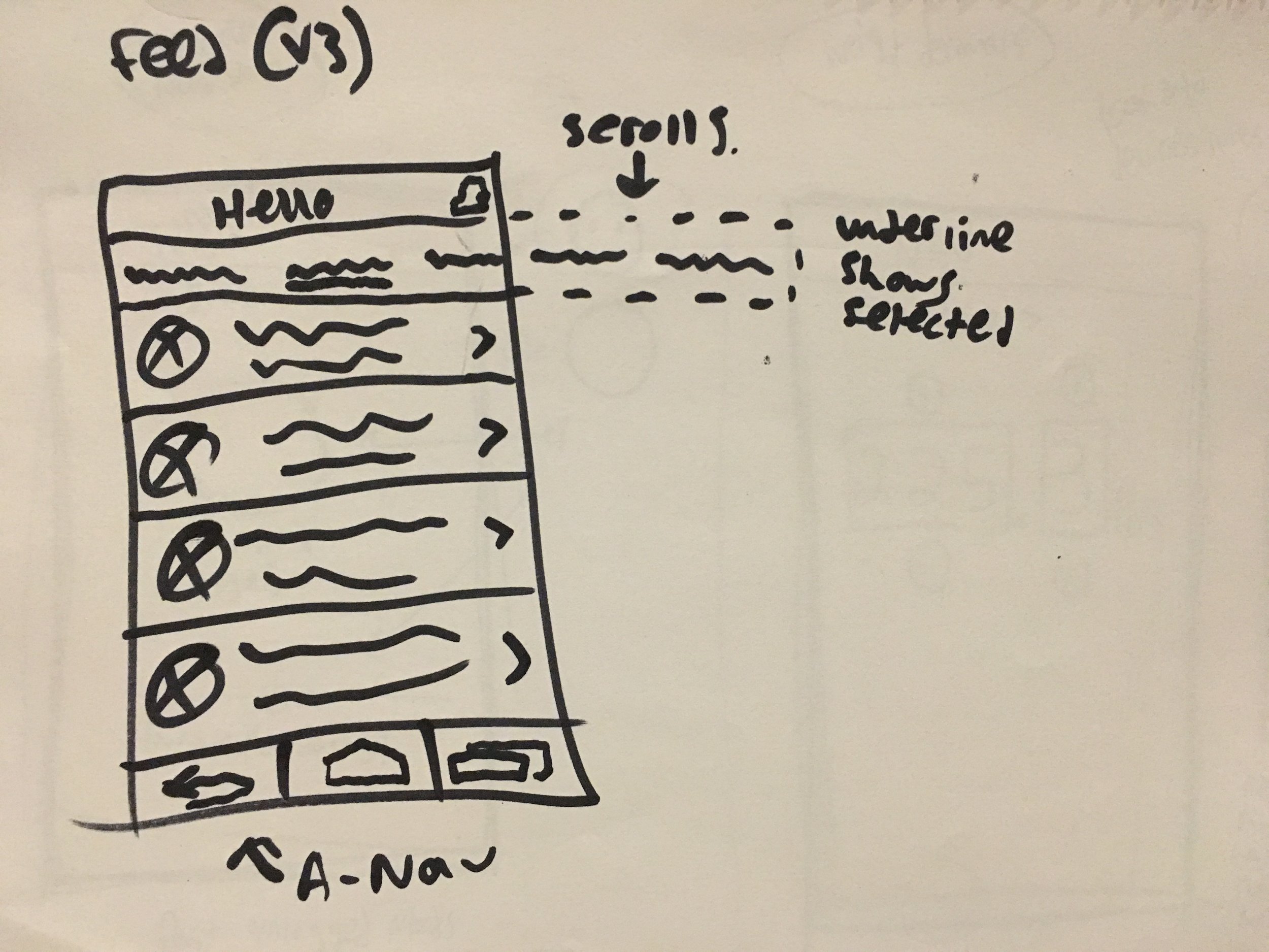
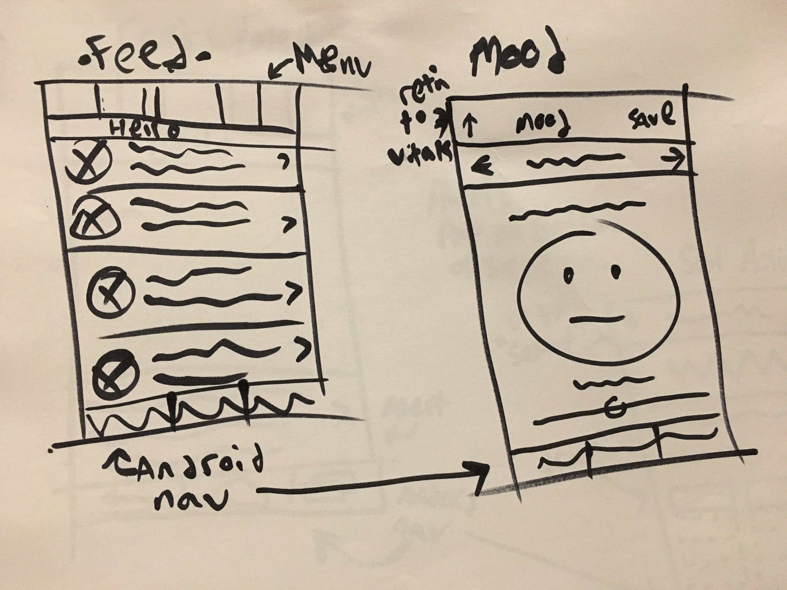
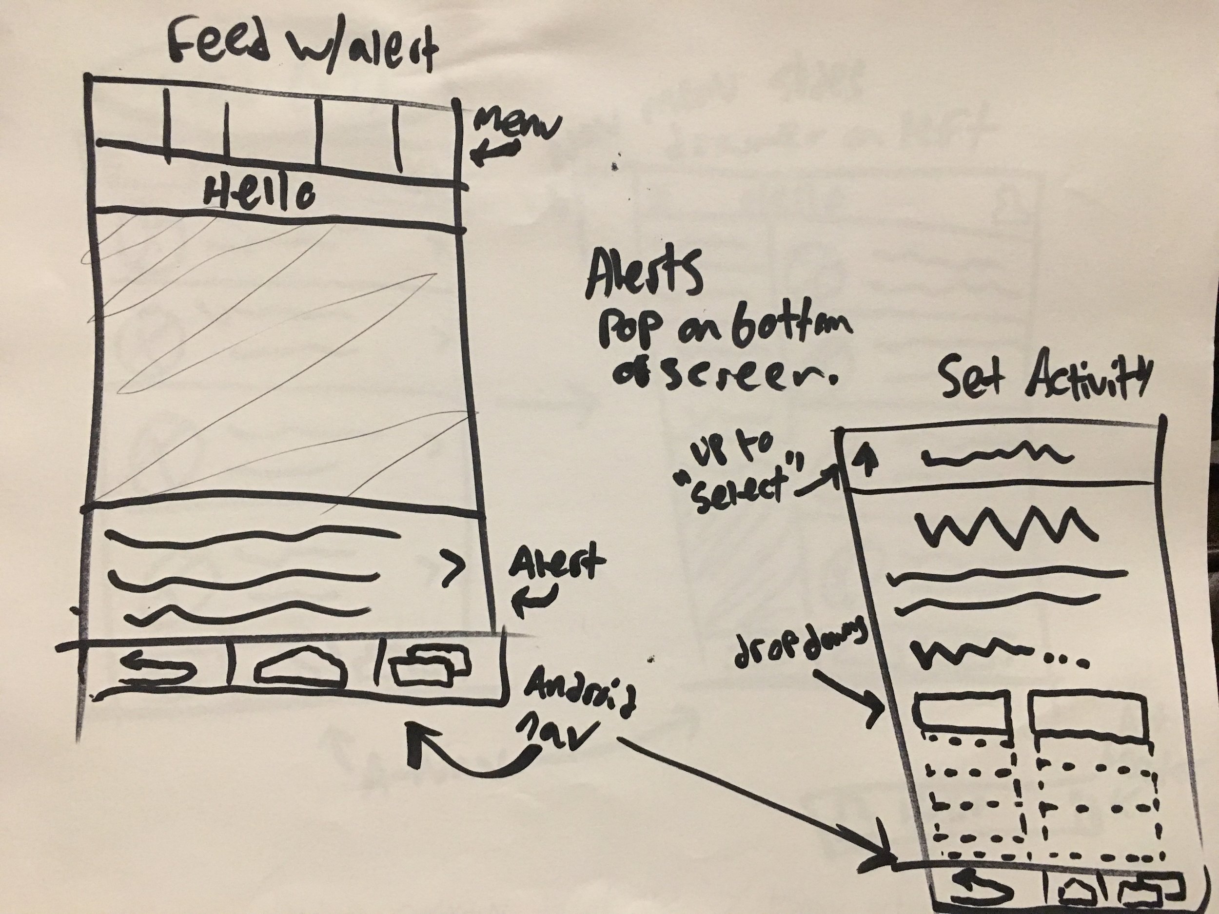
The next round of updates included a series of UX tweaks as well as support for the Walgreens Rewards point program. This round, we were also able to implement some changes based on user feedback from C-Space, our client's user testing vendor. I really enjoyed this round because it involved lots of sketching and problem solving.
Updates:
Ability to log data from days in the past
Added a null state for days where patients did not log data (it was defaulting to the most recent entry)
Ability to track weight to the decimal
Patients can complete an exercise multiple times in a day
Save photos of medication containers and insurance cards for easy access
iOS Release 4 Wire Frames
Release 4 Functional Specs
Immediately following the previous round of updates, we began work on adapting the experience from iOS to Android. This involved intensive research on Android phone UX best practices and Google Material design guidelines. After a series of discussions with the client, we agreed to make tweaks to specific aspects of the navigation, menus, and pickers to make it more efficient for Android users without fully overhauling the app.
Android Wireframes
I also created the Android version of the yet-to-be released "Caregiver" app, which was similar in functionality to Heart Partner, but, as the name would hint, focused toward caregivers and not patients.
Orilissa App
Orilissa an in-progress app for Abbvie, a pharmaceutical manufacturer releasing a new Endometriosis medication. The disease affects women, is incurable, and causes intense pain. This app's purpose is to accompany their treatment, which is intended to reduce their pain. The client requested the app act as a central hub for their patient’s health, tracking all possible information that may relate to their pain and well-being.
Neon was approached to pitch for this work in June of 2017. We worked around the clock for 2 weeks to produce two version of the app; one that fulfilled all of their feature requests, and one that contained what we thought they really needed. We delivered sets of wire frames for both, a finished visual treatment and prototype for the 'Neon' version, and a pitch deck to explain why they should go with us.
Here are the Wire Frames we circulated internally to create our final design for version A.
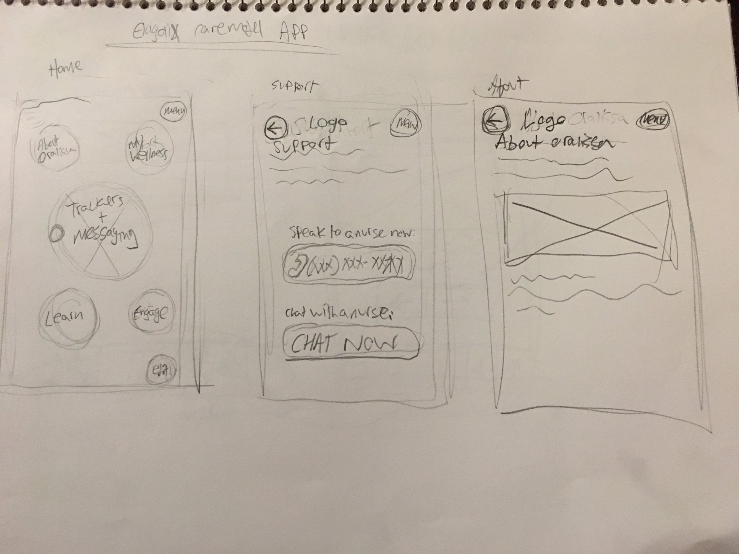
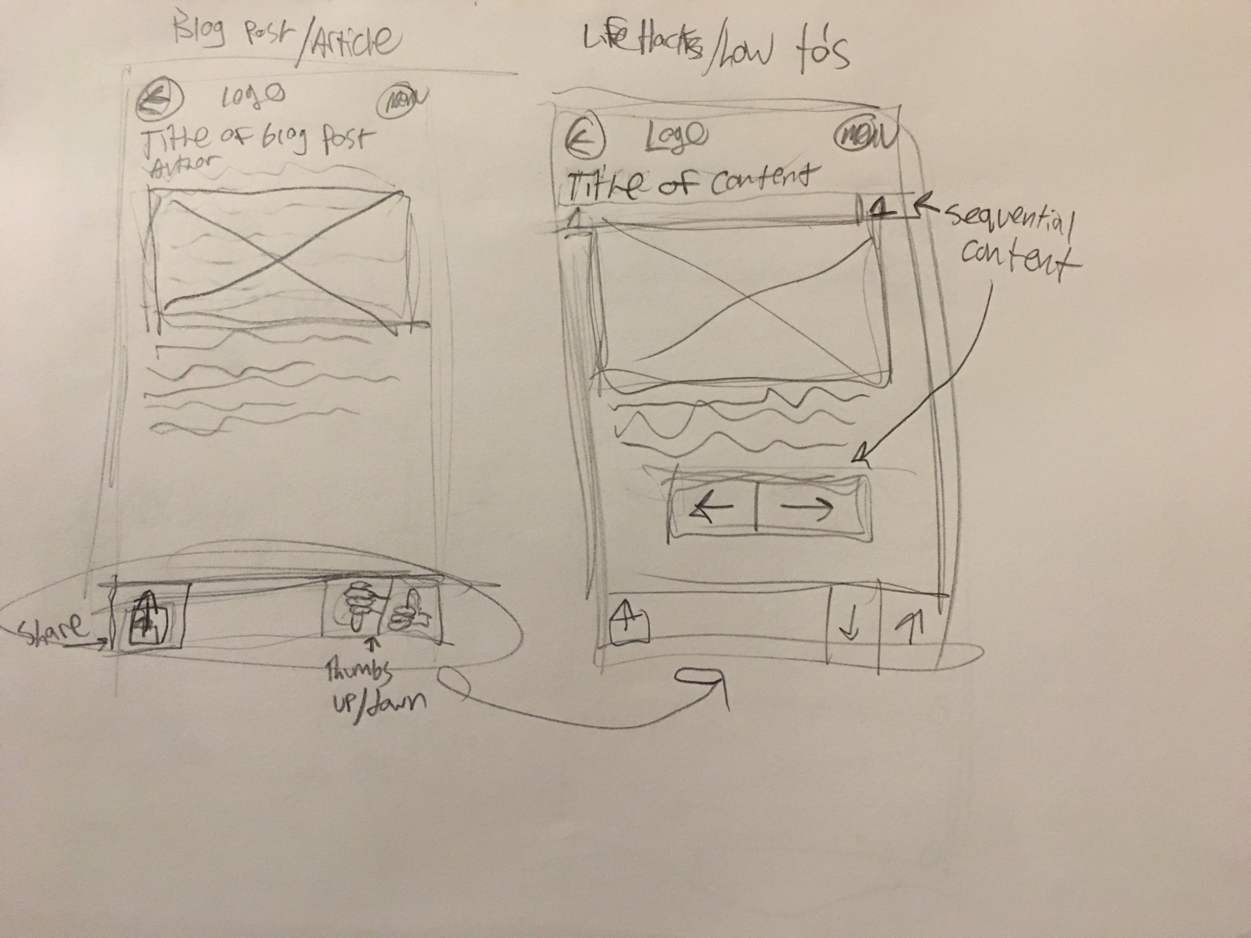
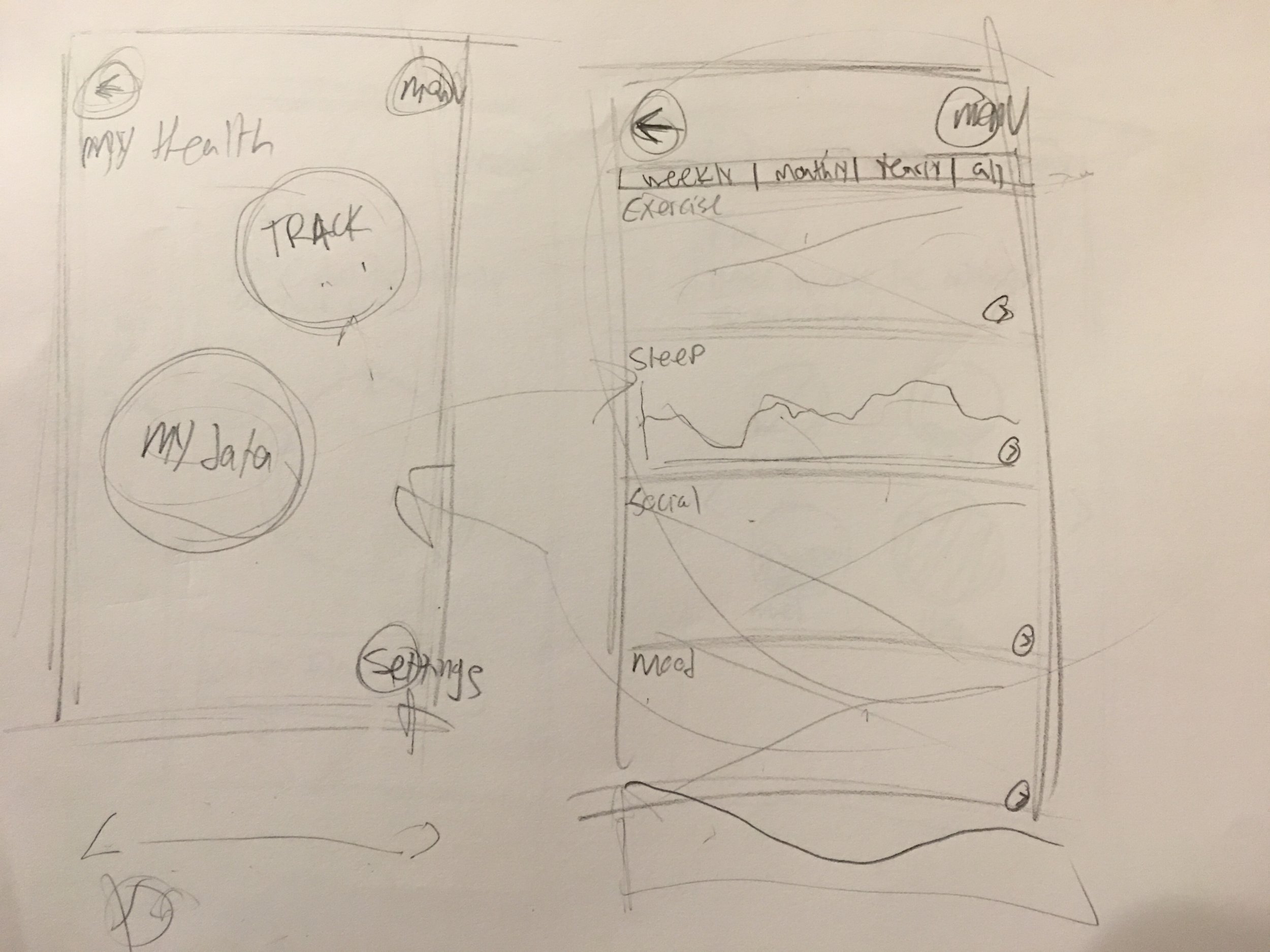
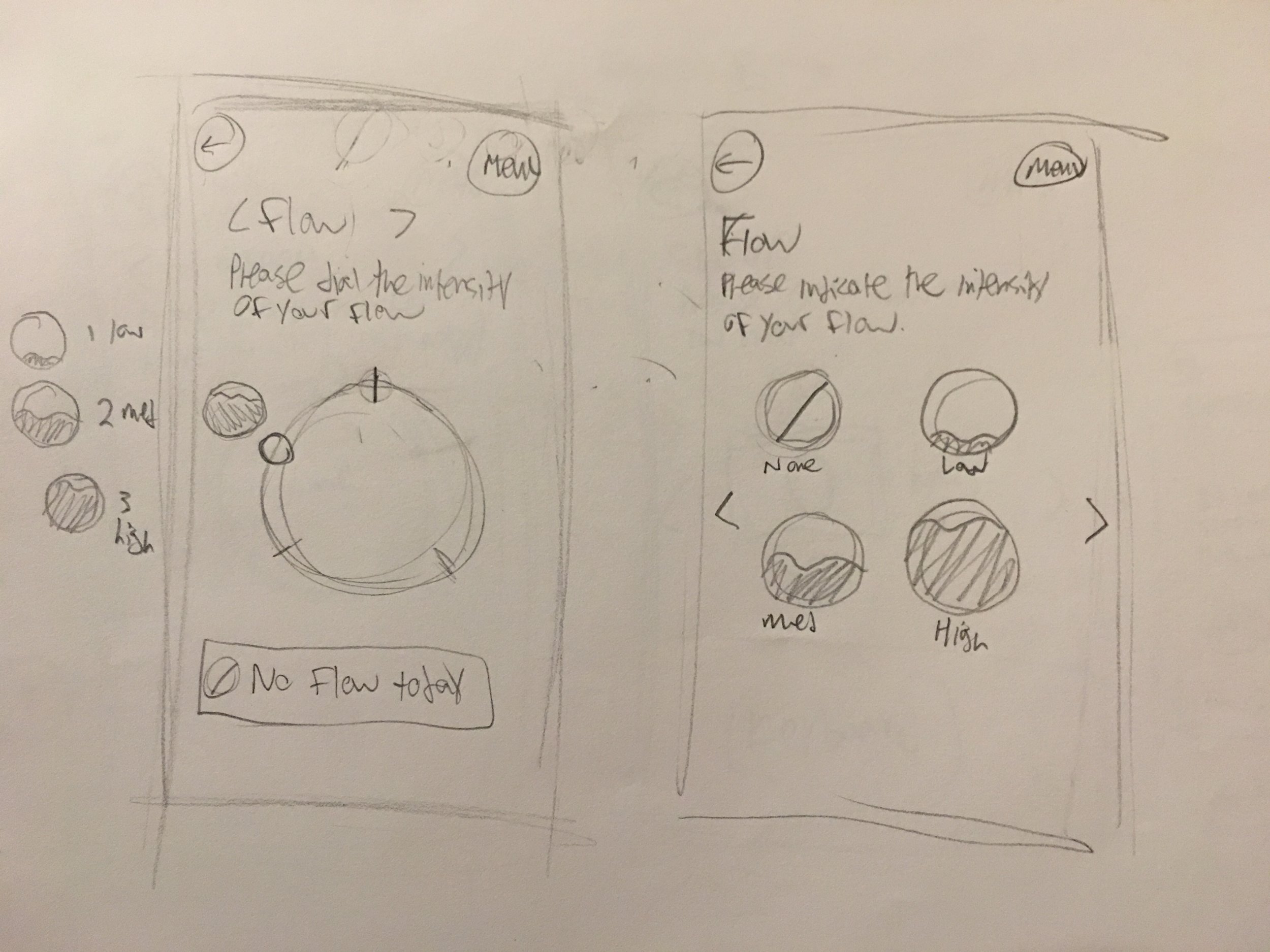
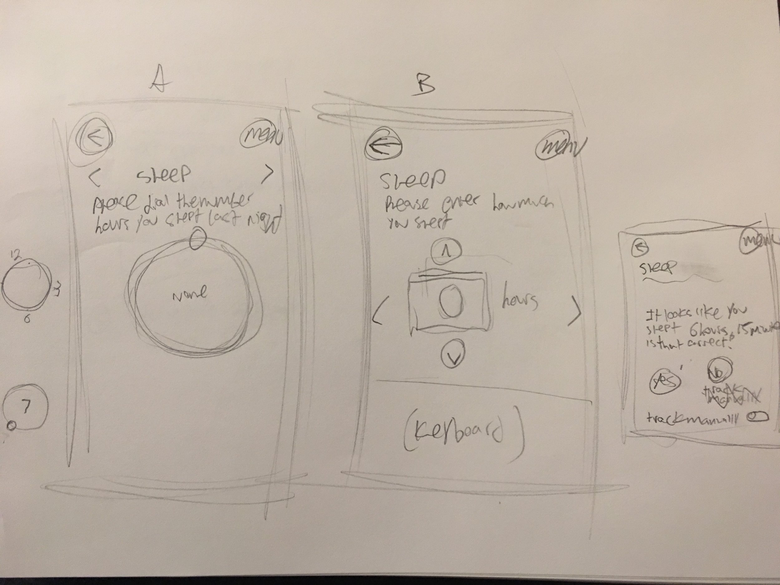
This is the pitch video that was sent out following our presentation. It represents the creative vision for what the app may end up looking like. The visual design was executed by our Associate Creative Director.
My UX approach for this app, holistically, was the idea of community and support in helping these patients know they are not alone. The medication and the app will not fully cure their Endometriosis and the best we can do is assist them in managing pain both psychologically and physically.
Many of the features we proposed revolved around this thinking:
Meditation sessions using VR and sound therapy
Community message boards to share tips and encouragement
Articles and blogs served up according to their responses to logged health data
Background color shifts and flows through branding colors as community 'Mood Ring' to show anonymized pain and mood status of nearby patients using the app
*We won the pitch.*
Next, we began our conversations about what features should end up in the app, and eventually landed on the agreement that it would be built out in phases to allow us to scale the experience gracefully. As part of this conversation, I created this visual representation of our phased approach.
During our feature discussions, I was conducting further research on best practices for health tracking apps, giving extra focus to the user input affordances and indicators. This brought me to the conclusion that the input proposed by our Creative Director, dials for everything, may not be the most intuitive for certain tracking parameters like Mood, which isn't a linear concept, or Weight, which would be difficult (both in determining what our maximum on the dial would be, and the usability issue of having 100 directly next to 0).
The outcome of theses discussions was to create two prototypes to put into user testing; a version A containing dials to track and featuring a more circular interface and version B which adhered to best practices discovered in research, using a single tap for input.
Due to the demanding nature of the project, it was transitioned to another UX Designer that was hired, so I could continue working with the agency's other existing clients.
This is my final version of the Wire Frames, before handing the project off.
Epilogue: After 2 rounds of user testing, version B was the favorite among patients in the Endometriosis community. The team has moved forward without version A.
RethinkMSRelapses.com Redesign
One of Neon's clients wanted to add some new content and discuss possible UX improvements to their "Rethink MS Relapses" website, a site with resources for patients with Multiple Sclerosis to help manage their relapses.
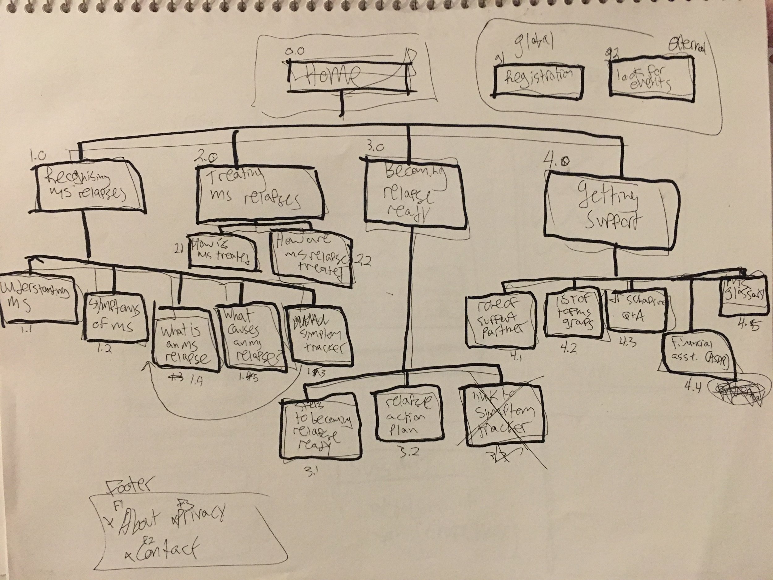
To start, I did a UX and content audit of their site, identifying places where we could streamline the experience and communicate their information in the most effective way possible. One of the sections that jumped out at me most was their Relapse Report tool, which was a great idea but was difficult to understand.
Next, I conducted a quick card sorting exercise with the team, aiming to eliminate a lot of seemingly repetitive and unnecessary content. Using the output from this session, I worked with the copywriter to create a new sitemap that would account for our new content.
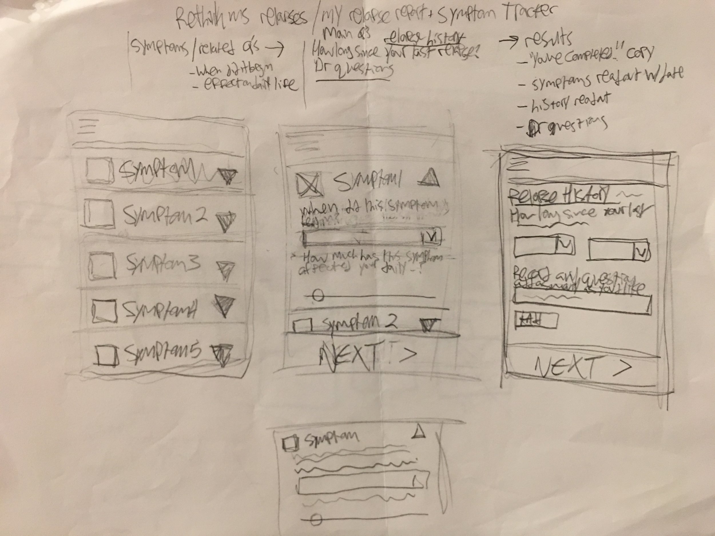
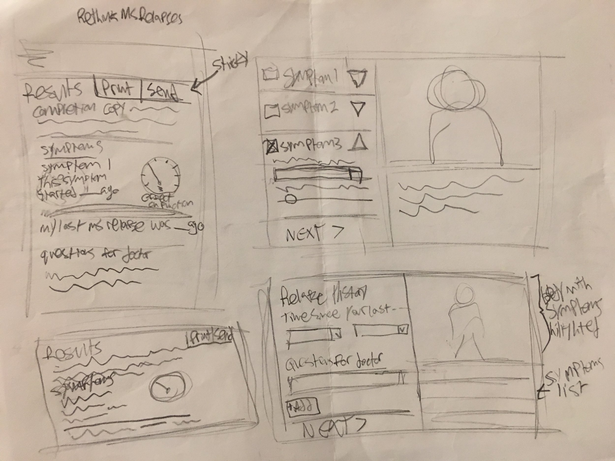
Since many account teams at Neon are dedicated to a single brand, I like to ask their help in better understanding the trajectory and history of the product. To do this, I lead a series of sketching exercises with the rest of the team, discussing ideas for how the new areas should work, and ways we all think the existing areas could improve. The output of these exercises is our first round of Wire Frames.
Some of the improvements to the site included:
Rearranged Home page content to prioritize their new e-booklet
Simplified the Relapse Report flow to increase patient completion
Redesigned the Relapse Report output to provide more value to the patient
Streamlined content and reorganized using our card sort findings
Those Wire Frames went through several iterations as I worked with strategy and the account team to ensure all of our client's needs were met, leading up to a presentation to our client, Ed, who approved the work with no revisions.
Rethink MS Relapses Wire Frames
The site is currently being re-skinned by the team's Art Director, and should launch sometime in early 2018.
"One Simple Question" Website
A client asked our team at Neon to come up with an interesting way to deliver Health Care Providers with data customized to the specific needs of their patients. I worked with the Art Director and Copywriter to sketch an idea our Art Director dubbed "One Simple Question".
The Page greets HCPs with a friendly face, and the simple question "What are you patients concerned about?". We originally planned the area below to be an open text field, which would allow our users to enter their answer and see search results. Upon further discussion, we agreed that this would be cumbersome for our users, who are frequently seeking multiple kinds of information, potentially forcing them through the flow many times. My solution was to present the answers as a field of multiple choice responses to allow them to select any and all available information in one pass.
Next, the user is presented with a customized single scrolling page of all of their relevant information, where they can either go back and modify their content, or view the main menu if they didn't find what they were looking for.
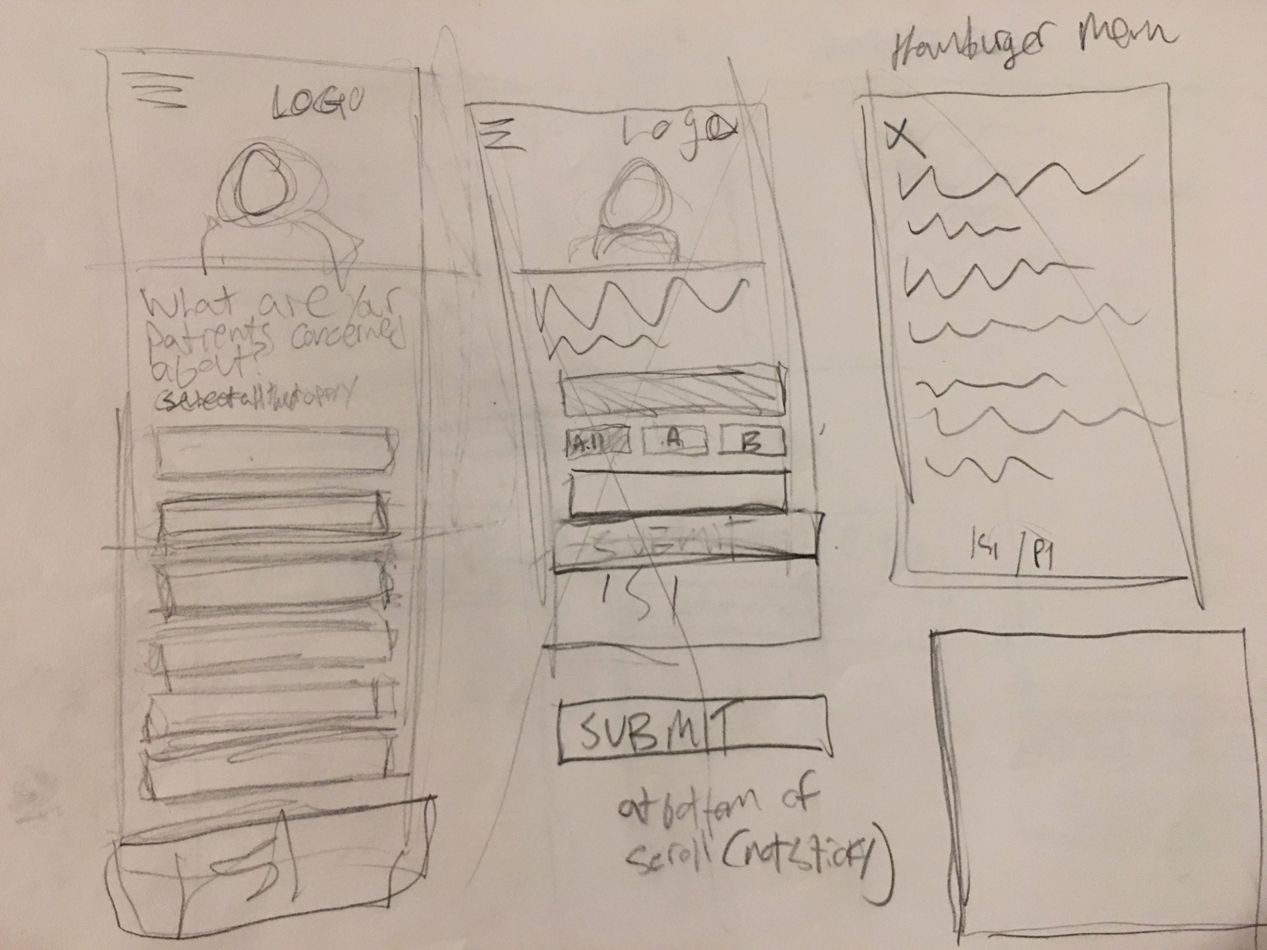
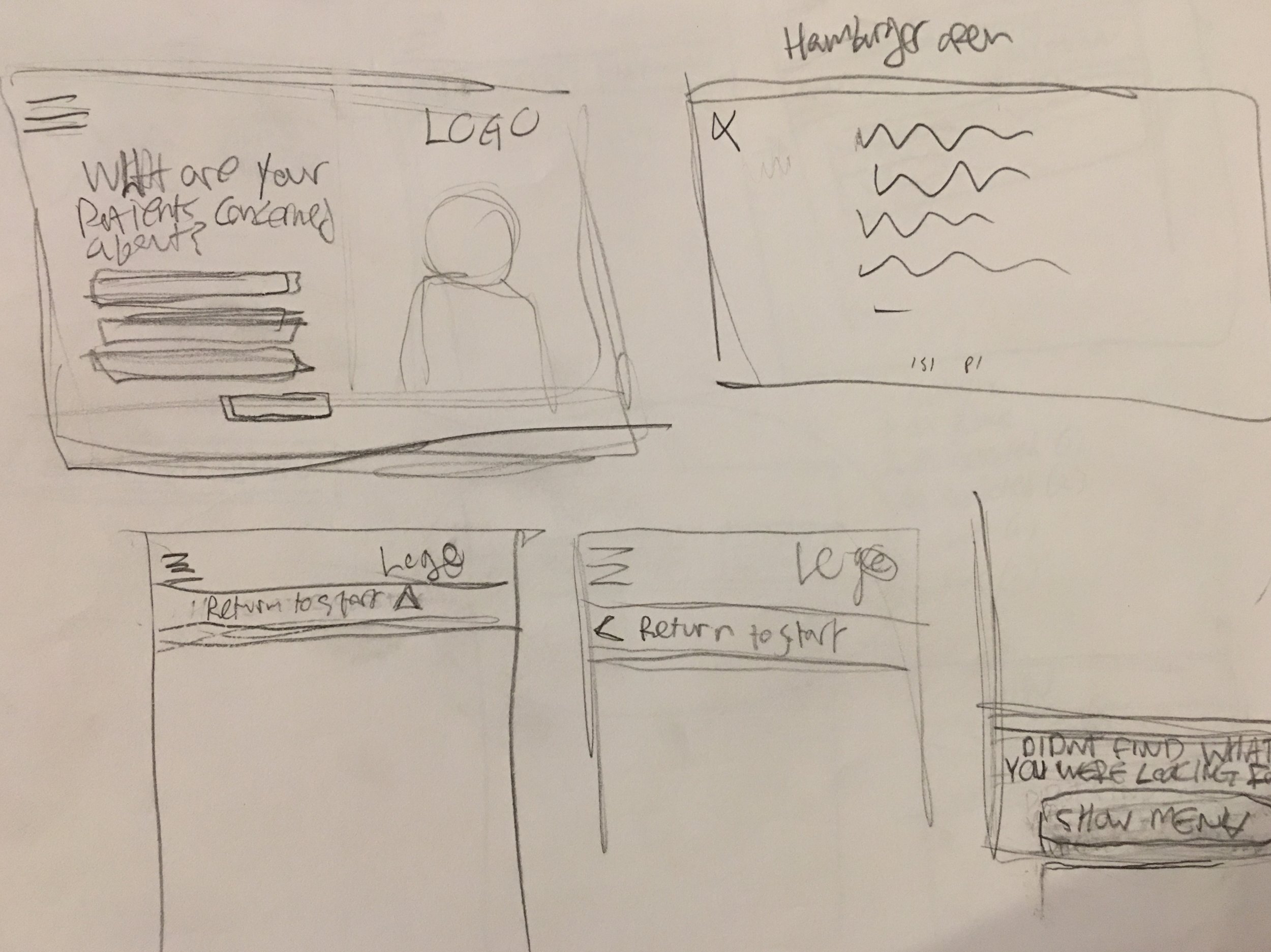
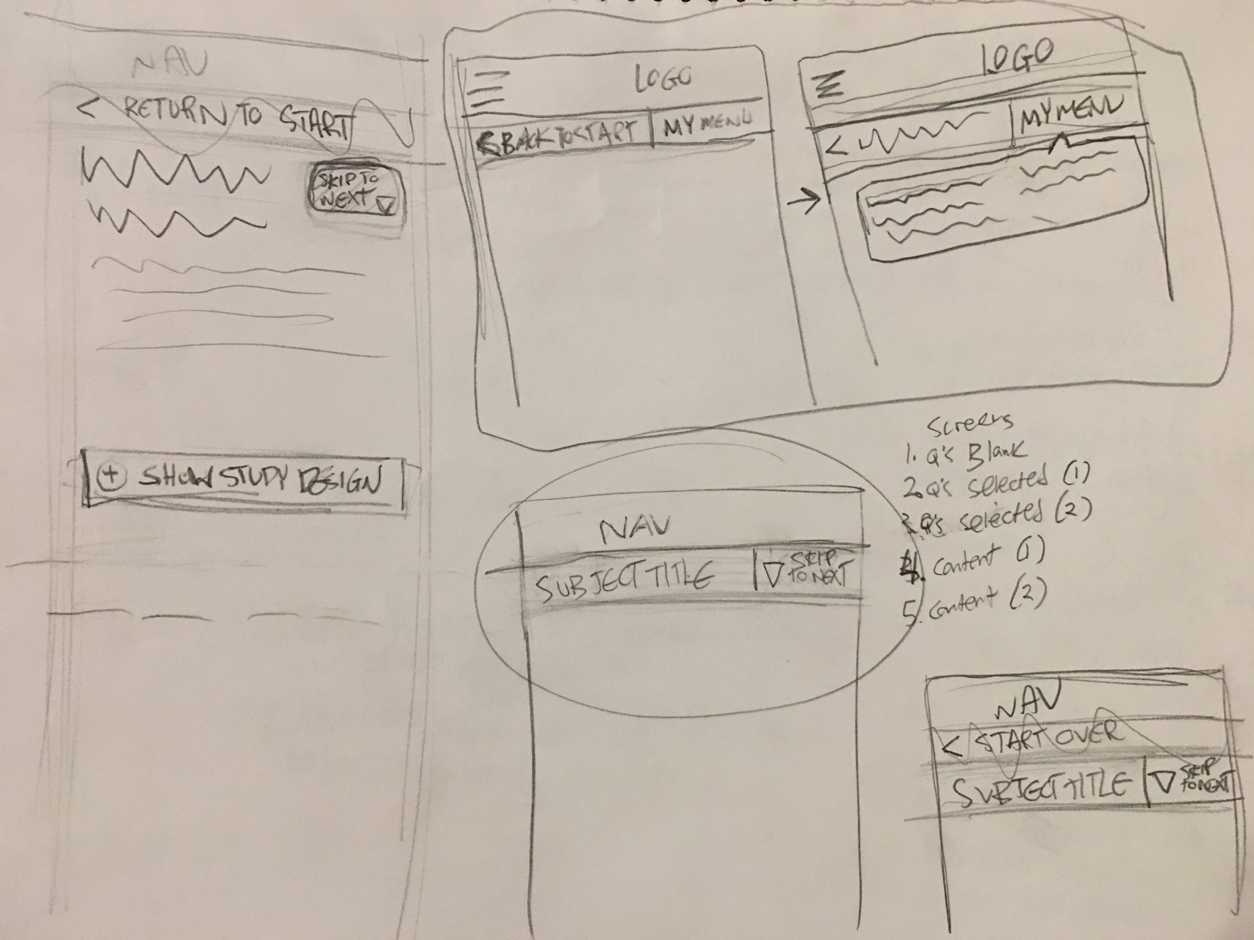
I created a quick prototype of our idea to show to the client, so we could get buy-in before moving forward.
Above right, you can view this prototype in action.
The clients approved, making some small changes to the wording in the menu, and I moved into creating fully fleshed out Wire Frames for the mobile and desktop experience.
One Simple Question Wire Frames
The design is now in account limbo as the client reallocated their budget to other projects.
Left are some visual design treatments created by our Art Director that illustrate our idea.
Invega Sustenna & Trinza Redesign
A client at Neon tasked the team at Neon with redesigning two of their websites, the Health Care Provider sites for Invega Sustenna and Invega Trinza. The timing of the redesign was to align with a new set of templates and design standards for the client. I enjoyed this project because it involved a lot of client interaction in presentations and workshops.
The first thing I do with a team looking to redesign something is to conduct a UX and content audit of their existing property. I love this part of the redesign process because it feels exploratory and investigative.
Invega/Sustenna UX Audit Presentation
As part of the conversation during UX audit client presentation, we all agreed a great next step would be a card sorting session. This helps us streamline their content, which over the course of a few updates, had become repetitive and bloated.
We chose to conduct the sessions separately for each site, due to time restraints and the large amount of content across both sites.
Involving an even mixture of client and Neon participants, we created 3 groups (2 groups of 4, 1 group of 5).
In each session, the teams completed 2 sorting exercises:
A closed sort, where we asked participants to sort cards representing each piece of the websites' information into the sites' existing categories, encouraging them to add new and remove irrelevant content
A story sort in which we asked teams to show the order in which they think a given user type would visit pieces of information on the sites
Invega/Sustenna Card Sort Findings Presentation
Since the teams aligned very closely in their decisions, these findings were useful in working with our copy writer to create our updated site maps.
The account team wanted me to create a presentation for the client to explain our thinking for the proposed sitemap changes. This enabled us to have a great conversation about content with our client, ultimately leading to two fully updated sitemaps.
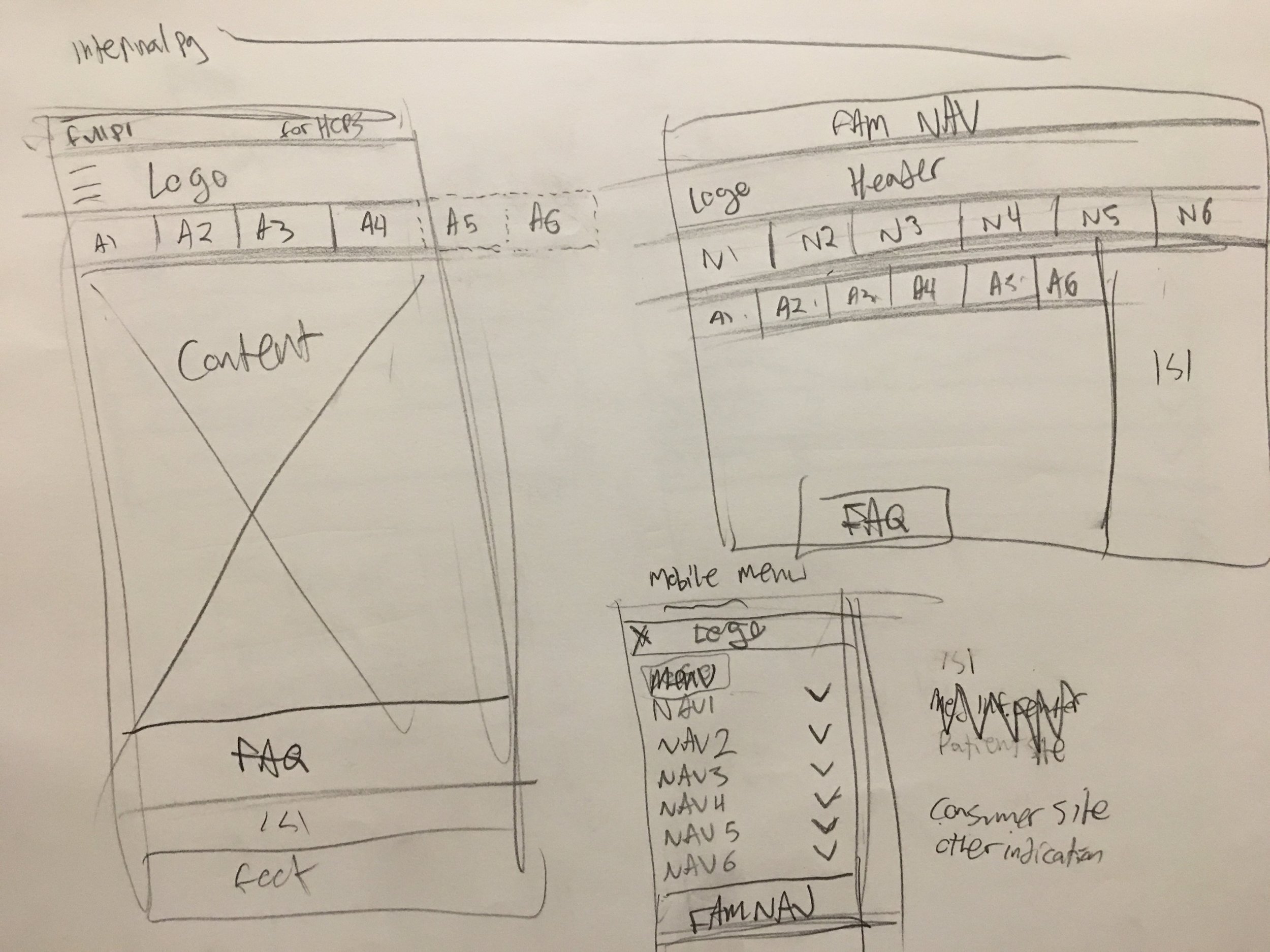
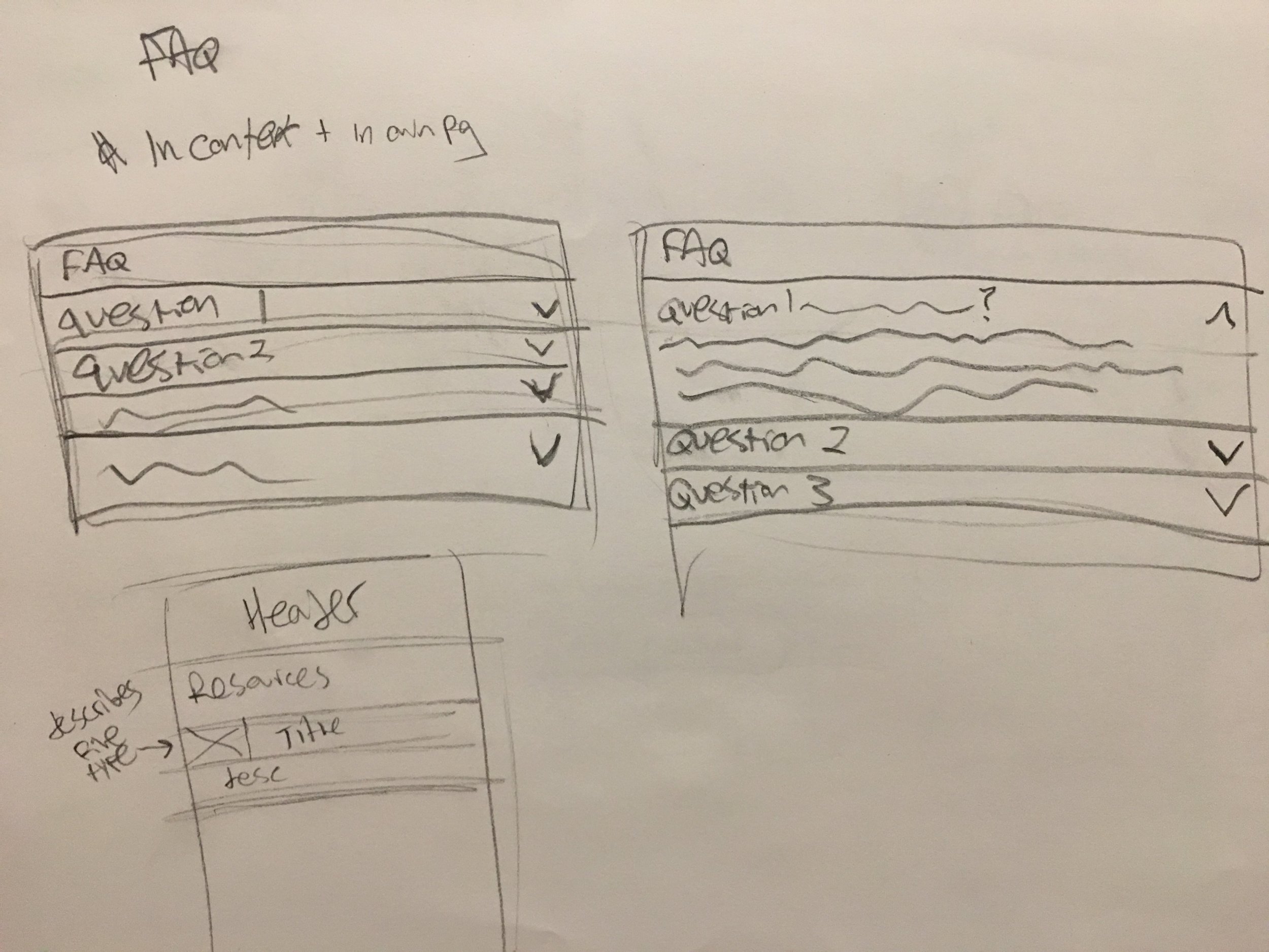
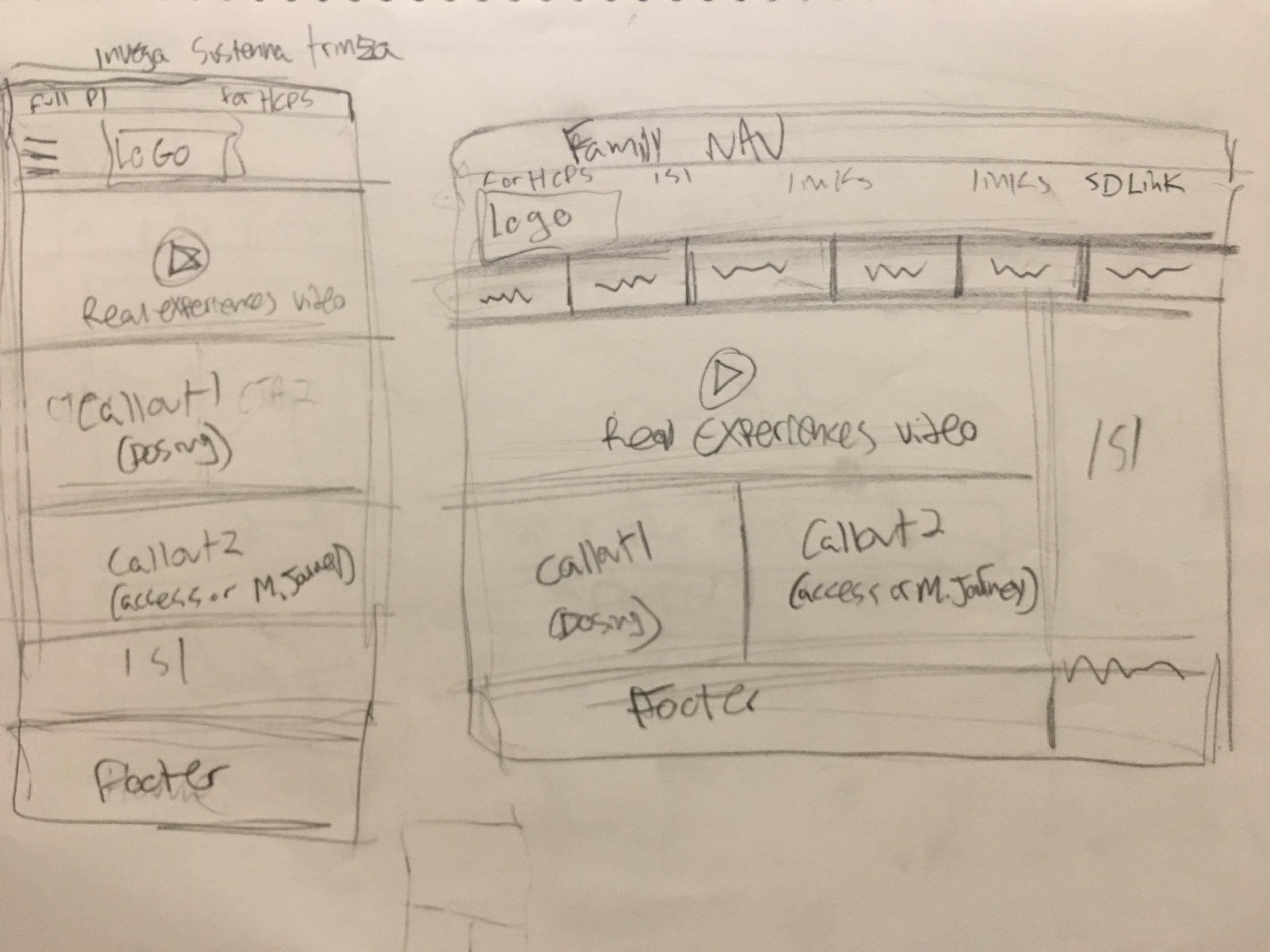
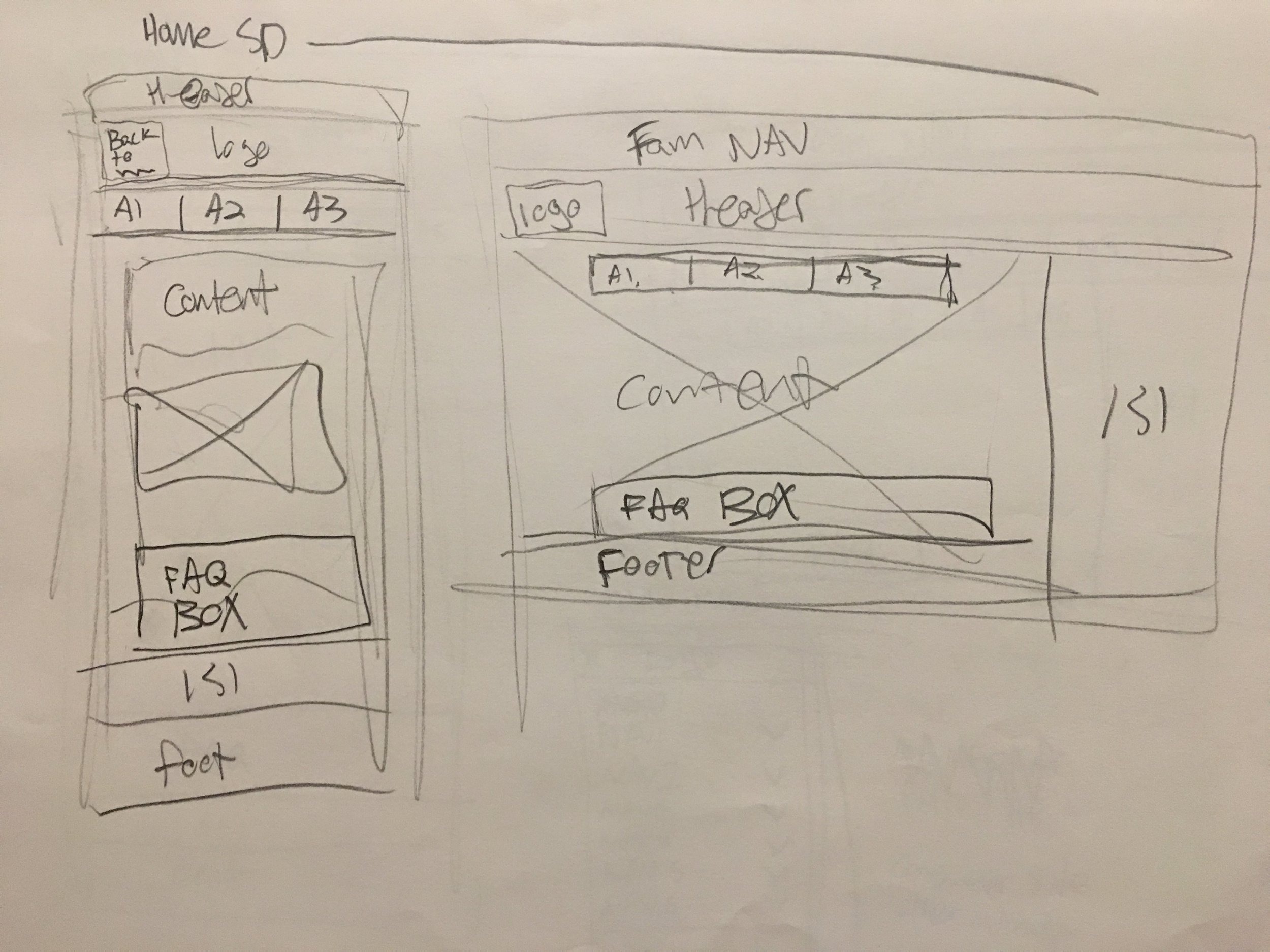
After we all agreed on the sites' structure, I moved into Wire Frames. This build was unique in that we were given access to a partially finished design guideline document, that evolved and changed as I designed. This made the guidelines a bit of a moving target and resulted in a few pivots in my thinking.
Initially, I planned on designing the main sections as single long-scrolling pages with sticky anchor links in the header. This was approved at first, but then the client's SEO vendor informed us this would interfere with the new templates, making it impossible to tag content for analytics. My response was to update the design to divide the content into individual pages.
The design is currently in development and will launch early 2018.


